Show Us Your Bryce Renders Part 10
This discussion has been closed.
Adding to Cart…

Licensing Agreement | Terms of Service | Privacy Policy | EULA
© 2025 Daz Productions Inc. All Rights Reserved.You currently have no notifications.

Licensing Agreement | Terms of Service | Privacy Policy | EULA
© 2025 Daz Productions Inc. All Rights Reserved.
Comments
and here is another :)
mermaid : Excellent image, beautiful colour effect.
Tim82 : great renders, I like the texture on both.
Tim - both figures have excellent material fitting the lighting perfectly.
A W.I.P. image I am trying to use on the sewing envelopes I am making and give away as freebies. There is a part that I have difficulty to remove (small black square - seems some kind of shadow but have no idea of what) in front of the Georgian style dressed male. EDIT: I have just think, best will be to give the male clothing a black texture in stead of white. Have done that on back part image - have to paint out poke-through.
I have used Wendy's clothing on Genesis (male & females). Staircase used from Sketchup Warehouse.
another old render updated :D
Very beautiful still life!
Obviously, the render time was long, given the size and availability of transparent materials.
Also, a very interesting post processing.
@slepalex, render time was roughly 25 minutes...and the post work was just a bit of glare and a vignette on the border :)
launok - good work.
Tim82 - I just seen it in the galleries and thought first it was by Slepalex - and this is a compliment.
launok : very nice image.
Tim82 : impressive still life.
thank you for the nice comments :)
Tim82 - Stunning still life, very realistic!
adbc & Horo -
Thank you! I am making now freebies (to give back to the community) but had struggled quite a bit to learn making these envelopes. Adding textures is the main problem. Even with this one I made a mistake at first as back image initially appears black. Then have to go back to Sketchup model and check out the problem. Forgot to 'reverse faces'. Now it works.
  I always test it in Bryce first before uploading at ShareCG and Renderosity.
Hi all, hope everyone’s having a good day.
I’ve had this outfit by Out Of Touch for quite some time but had a lot of trouble posing it (due to the large number of morphs). Finally took the time to get a handle on it and this the result.
Title: “Porttrait”.
Besides OOT’s outfit and Character, the hair is by AprilSYH and the jewerly is from WildDesign.
Room and screen modeled in Modo. Screen image from a wall mural in Mexico city
Illuminated by 2 Doe lights Staged and rendered in Bryce 7.1 @ 64 RPP, TA enabled.
Thanks for looking and keep on Brycein’…
Dan Whiteside - Wonderful, colorful image. Looks very realistic, great background.
25 minutes? This is amazing! I guess you have a supercomputer.
Another version of aged bronze.
Thanks Jay, Horo and Adbc for the comments.
Tim - the dragon renders are awesome, cool lighting and great material, the still is beautiful, the vignette adds to the beauty.
Laura - very nice render. Like the staircase do you have a link to it.
Dan - excellent render.
Slepalex - great render, the lighting and material awesome
Thank you!
Here is the link - it's a sketchup model but I have exported it as .obj. https://3dwarehouse.sketchup.com/model/bee7465ed0b06104a55a2eafff111bd2/The-Grand-Staircase-update-no-2
Check out the uploader's profile - has more options.
Just want to add the grand staircase have a fuller wall at back but I cut parts out due to texture issues. Also changed textures on wood railings due to same problem.
Dan Whiteside : Outstanding render;
Slepalex : great material.
@mermaid010, thank you :)
@slepalex, i do have a very good computer, but the render time is just a trick of clever lighting :)
Dan - beautifully presented lady.
Slepalex - the aged bronze looks good.
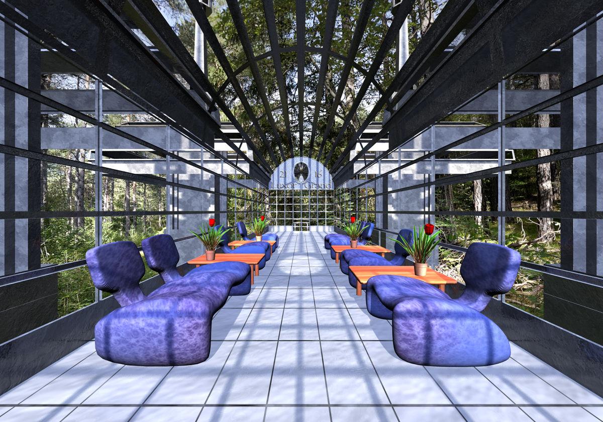
The building is a small part of Dan Whiteside's Tech Building, seats and plants are from the Internet, tables and floor are self made. The forest environment is the tone-mapped Green Path HDRI as LDRI panorama on a sphere, the GreenPath_SC HDRI lights the environment and the sun provides the key light.

Thanks for the link
I was searching for more staircases and vintage buildings, then noticed the staircase I have used are actually from the Titanic. There are great rooms and decks at Sketchup Warehouse based on Titanic. This I can use for period renders.
Horo : impressive image, just want to walk inside and have a seat in that beautiful environment.
Render of a Victorian style cafe setting. Used Genesis and Wendy's Roaring 20s clothing on ladies and Georgian style clothing on male.
Very good works in here. Sorry for not taking time to comment on all, but I love what you are doing!
Horo - I agree with Adbc, nice place to relax
Laura - very nice render
Thank you adbc and mermaid.
Five identical terrains, four of them differently warped and all given an almost identical material. Volumetric clouds pre-rendered as HDRI.
For the anaglyph, haze was disabled.
Horo - another awesome set of renders. I must remember to turn off haze when I do the anaglyphs, so I can get better contrast in the anaglyphs.
Here's an abstract anaglyph from a while ago.
Horo : Excellent terrains and anaglyph.
mermaid : wonderful anaglyph.