Adding to Cart…

Licensing Agreement | Terms of Service | Privacy Policy | EULA
© 2025 Daz Productions Inc. All Rights Reserved.You currently have no notifications.

Licensing Agreement | Terms of Service | Privacy Policy | EULA
© 2025 Daz Productions Inc. All Rights Reserved.
Comments
I think we all suffer from the is it as good as I think and hope it is syndrome. And I know I've said it before, sometimes, the stuff I like the best and secretly think is awesome gets barely an attention, and stuff that I'm a bit embarassed to post, everyone seems to love. Go figure lol.
I do think that we are all getting better at this and sometimes, I go back and look at my earliest renders or even renders I did 6 months ago and realize, hey, I could do that so much better now. That helps keep me encouraged as well. That and the fact that I am not scrapping nearly as many renders as I used to. And, its becoming easier to put together stuff that looks more like what is in head. Not EASY per say, but easier.
And yes, once all the grain is gone and its run for an hour with no perceptual change, its time to shut it off lol.
Turns out that 95% is the default not 98% convergence and I had my render set at 95% not 98%. Not sure why I was thinking I had the setting at 98%. Anyway, I tried a different camera angle to get a closeup view of Sol in her warrior mode.
wow.....these are fantastic, KM. Really well done- thank you!
Thanks, DM! I'm glad you like them. :)
I couldn't resist doing a nude render of Solange. I think it turned out pretty good. Anyone wanting to see it can find it on my DA page here.
Yep, she's a sweetie (although I wouldn't want to get on the wrong side of her!)
I know what you mean. I loved her so much as a warrior I thought up another render to do with her as a more modern day fighter. Hopefully, the idea isn't beyond my skills. I think I can pull it off, though. Still setting it up.
While I was waiting for a render to finish, I thought I would take my first render of Solange into Gimp and try a little bit of postwork. To my horror, I can't find her!!! I always save as a .png in the render window and then as a .jpg using the 'Save Last Render as' option. I know she was on my computer because I uploaded her to the forums. I have no idea where I put her! The best I could do, for the moment, was save a copy of the .jpg from the forums. Not my first choice as I think the forums mess with the images a bit. I might have to render her again if I want the .png file and can't find my original. Thank goodness for saved scenes!!!
Anyway, I took a copy of the image saved from my thread to try and play with postwork. I suck so badly at postwork when it comes to this type of picture! Just about the only thing I do halfway decent is levels and curves. The NPR postwork stuff is so much easier. Realistic type images, not so much.
So, I played with the Levels & Curves a little bit. Not sure if I'm completely happy with what I managed. I think it might be a little too bright now. Let me know what you think. FYI: I love advice any advice to help me improve my postwork.
Original:

Postwork:

Here are two more with the NIK Filters.
High Key Filter:

Levels and Curves second try:

I really like the high key one.
One thing you can do if you are happy overall with your render but want to brighten up certain things with postwork is to use the dodge and burn tools. I have no idea what those are called in Gimp though. Its the tool where you can brighten just the shadows or the highlights or the mid tones. I actually use this one a lot, set to a very low opacity as its very easy to go overboard and get spots too light or too dark. That way, you can just highlight part of the eyes or you can lighten whichever side of her is catching the light the most, or darken shadows on the other side, or just use it to lighten the side of the face that is darkest if you want to be able to see a feature better. I use a soft brush or a skin brush and adjust size as needed. Its also a great way to make the hair more dramatic subtely by lightening the highlights and making the shadows deeper. I know you know to use a copy and save often, but I'll say it again in case someone new is reading. Copy the original and rename it and save often! Once I do that I usually lock the first copy and then copy again and then start adding layers.
I also meant to say I like the first one as well. If you want to try the dodge and burn tool you could lighten just the character like you have in the first one but leave the background darker.
She sure is a stand alone beautiful woman!!!!
Gimp has the Dodge and Burn tools and they are still called Dodge and Burn. I just have not played with them yet. I might have to take a look. Thanks for the input. I appreciate it.
I agree! I can't stop playing with her either! :)
Dodge and Burn are super useful it you want to lighten and darken some stuff but not others. Just lightening the bottom part of the eye can really make the eyes stand out
I like her too :)
I do not use the dodge and burn tool much in Gimp. I can't say I like it much myself. Depending on what you want to do a person can use the layers tool dialog box and make highlights and shadows using white and black, Gaussian blurring them, and using overlay or turning down the opacity a bit. I will look around for examples I have done using that particular technique and post them. :)
I haven't used that technique before. Examples would be great. Yes, you can just post them here with instructions. We're all about how-to tutorials here. :)
I am so use to using Gimp for my screen shots I had to learn how to do it another way first. lol
Anyways, here is my examples the first is no postwork perse. The second is postwork using layers, etc. I just used a picture I have posted on my thread. I hope this gives you some more ideas. :)
So, you just add a white on a trasperancy while outlining the body and then use black on another transperancy for shadows? I've tried that before and they turned out horribly bad. Does using the Gaussian blur help to blend them in? I don't think I used an blur when I did that before. It kind of makes sense, though, because when I tried doing that before the lines were all too sharp and looked terrible. I suppose adding the blur and then maybe playing with the opacity probably helps with blending.
I'll have to give it a try. I have a new render that will be done soon with Sol and she might need a little bit of highlights as she's in a night scene and it does look to be a bit too dark. I'm afraid she's found herself in the wrong part of town. :(
Great and thanks! :)
This shows all my layers I used to make the various parts of my image. I used black, white, or some variation of color ( light yellow/orange) depending on what I wanted. I paint on separate layers maybe do some smudging, but usually always I use guassian blur. Sometimes I would leave a layer 'mode' on normal and adjust the opacity, or set the 'mode' on overlay. I made a drop shadow on this one by going to filters, light and shadow, drop shadow, then using guassion blur, and making any other adjustments to that layer as needed or liked. Basically that is what I did. One can expand on this if they like. I hope this helps. :)
Yea, guassion blur is really helpful in smoothing out things and it is always an experimentation on how much a person may want it blurred. My other tools to fix things are eraser and smudge tool.
I always use transparency for all my layers except backgrounds. Placement of shadows and highlights depends on if you want them behind or on the object. There are the little arrows to move layers up and down to where you want them in case a person has not stumbled on that yet. :)
I am by no means an expert, it is just things I have played around with to get certain affects. I have another example with more things that need shadows and stuff in it. Will dig it out and post it for more visual help and add it on this post.. :)
I'll do some experimenting based on what you've said and see how it goes. I really appreciate the advice. Between this technique and trying out Sonja's dodge and burn technique, I should be able to have some fun and see if I manage to figure it out. Thanks, both of you! :)
I really like the way you did the frame in your screenshot, too. I might have to steal, er, borrow that technique, too. :)
You're welcome. If it helps then I feel good about it. I hope it turns out how you envisioned it. :)
The frame took some work, now everyone knows why I do things in tons of layers. I don't want to have to reproduce it from scratch again. :P lol
I used a 'piece' of wood, the selection tools circle, square and fuzzy select, cut out what I wanted the frame to look like. I used the bevel 'tool' under filters, decor, and 'add bevel' for the circular frame. The trick though is in the shading and highlights to get the frame(s) finished look. It's been a long while since I did this, but I always save in gimp's native xcf file so I have those layers in case I want to add or change something. :)
Add: The highlights and shadows with guassion blur can make things go from flat to looking like the frames I made even though I did use the 'add bevel' filter. It was the last highlight i added that made this frame pop out as they say. :)
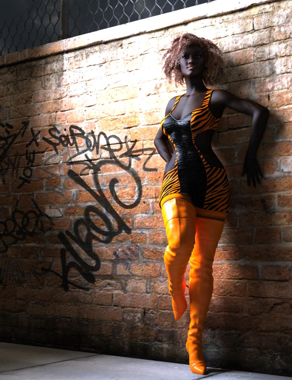
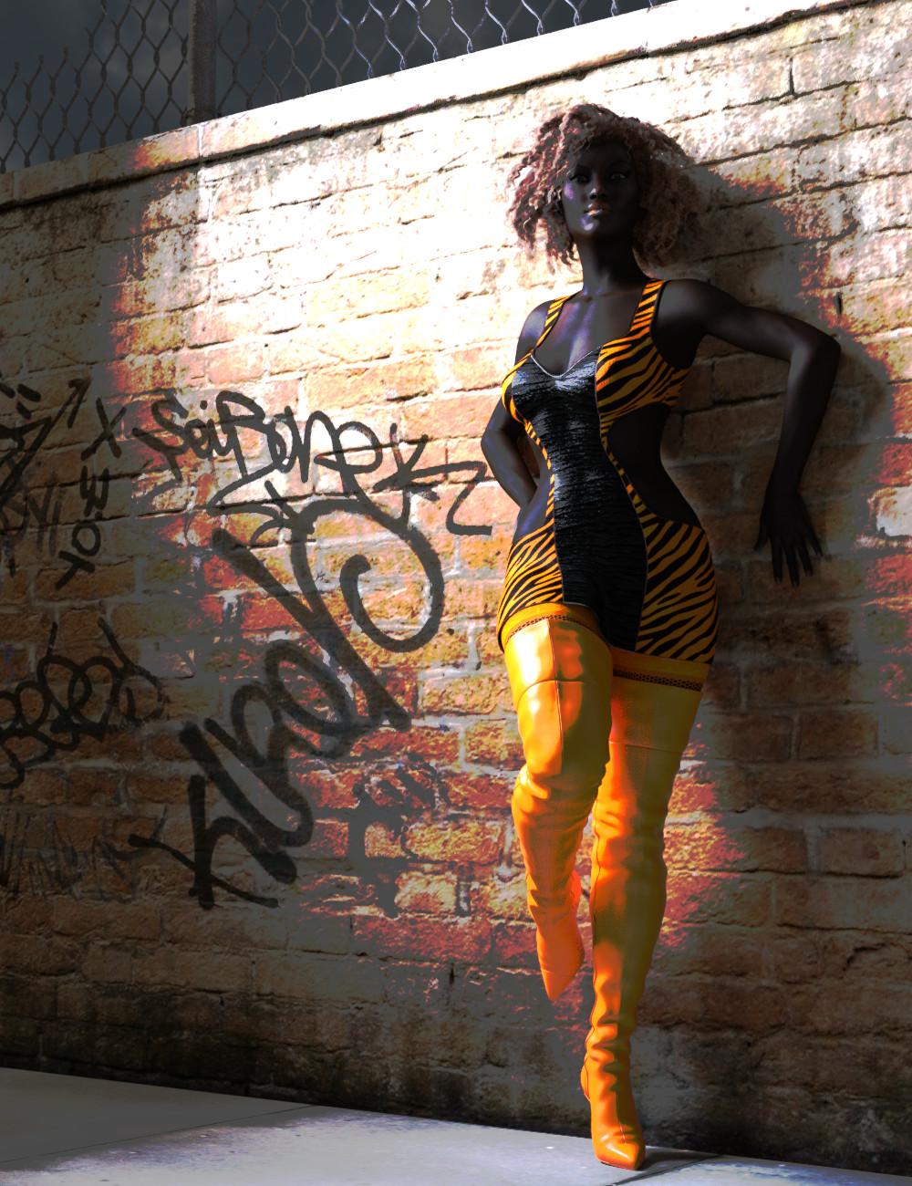
I had this idea for a render with Sol yesterday, but I couldn't find the outfit or boots that I wanted. I thought maybe I didn't have anything to use for the look I wanted. I finally found what I wanted when I was searching through the store today and found out that, yes, I actually did own it already and it was kind of perfect. I just had to make some textural adjustments to the dress to match the boots. So, I set it up and ran with it. I'm afraid, Sol might have fallen on hard times and is working in the wrong part of town. Either that or she's working undercover. The original was a little bit dark so I did a small amount of lighting just around the head with the levels. I finally figured out how to only adjust part of an image with the NIK filters! Yay me! I might play with some more in depth postwork if I can figure out what I'm doing.
Original:

Levels and Curves Adjustment:

So, I'm working in Gimp and I'm talking to Isidorn in a chat window at the same time. I'm in the middle of moving the Levels slider thing and the chat window pops up and interrupts the mouse movement. I ended up with this rather cool, kind of psychedelic look to my render. I thought I'd post it. I also thought I'd name after him. ;)
Isidorn's Levels and Curves Mistake:

lol on the mistake-very interesting effect there! I like that you named that after him, too. XD
I do like this-it's a great contrast in color and lighting, and I think you were right to post work it as you did. It was quite dark in the original. Well done!
Mistake? Pfft! I did that entirely on purpose, knowing what cool effect it would give.
I'm also playing golf with Santa Claus and the Unicorn Fairy Godmother...
@DarwinsMishap I'm glad you like it. I have some homework to finish up today for that Shader webinar that Esha has been doing. After that, I have at least one more fun render I have started putting together. Hopefully, I can manage to pull it off. We'll see. :)
@Isidorn I'm sure it was completely intentional! ;) I had to highlight the yellow just to read it with my old and decrepit eyes! I'm amazed you know both Santa AND the Easter Bunny!
Looks great! I really like happy mistakes myself. hehe
Yeah, me too. I'm not that crazy about the purple on her skin, but I do love the effect on the wall. That was kind of cool.