Daz 3D is part of 
Connect
DAZ Productions, Inc.
7533 S Center View Ct #4664
West Jordan, UT 84084
Licensing Agreement | Terms of Service | Privacy Policy | EULA
© 2025 Daz Productions Inc. All Rights Reserved.
Comments
Okay I think this is as far as I can take this one. I tried moving the top arm down and re arranging but it just wasn't working in a way that looked right. I did darken it just a slight bit in the hopes of making it a bit more obvious that its her arm.
Not sure if you can tell the minor tweeks I did but I tried to bring her eyes and her lips out a bit more without being too obvious.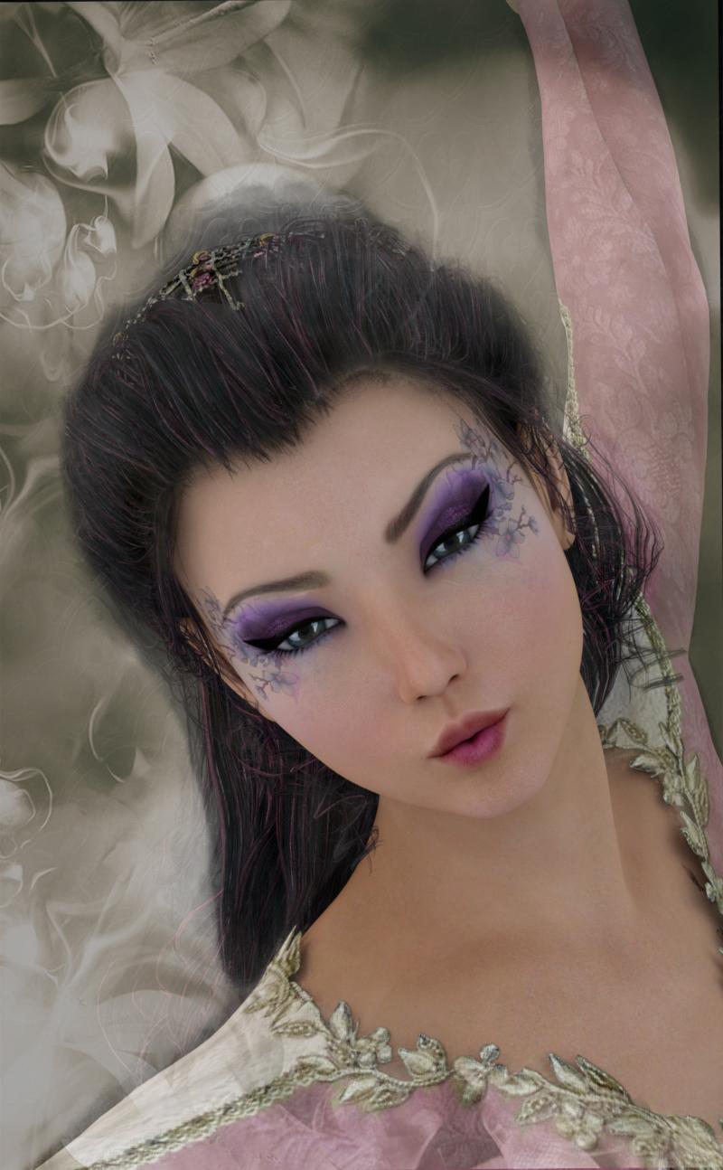
Good to know I'm not alone in that, at least. Just have to remember that when preparing to post. Wish I still had Photoshop for quick adjustments of that nature.
After some adjustments, I'm pleased. Now let's see how dark it looks on here ...
Getting much better, but still way too dark. Here is a histogram of your image. It shows that almost all of your pixels are below mid brightness, with most of them way below.
Here's version h. It didn't feel right when I tried to adjust his head to have his eyes more visible so I decided to try and give them a bit of glow.
I was going for a middle-of-the-night look, but I guess I need to learn the basics of lighting before I start getting too creative with it. You have to know the rules before you can break the rules, they say.
Anyway, here she is brightened up a bit.
Much better brightened up. If you want to suggest night, change the colors of the lights rather than making them darker.
Theres a strange shadow across her breast that I don't understand.
This is nicely posed, well framed, with some nice materials. But it doesn't have any life to it becomes the lights are flat. There's not contrast between light and shadow, there's not much in the way of highlights except on the most obvious pieces (jewelry and lips--lips are a little overdone). Her eyes are dead. There's a tiny little glint in there, but I can't make out her irises, they are just dark puddles.
How are you lighting this? Maybe we can give some suggestions if you tell us what's going on. Have you looked at any of the references at the beginnig of the contest thread? I have read the Lighting Tips from the Masters article too many times to count.
Reading and learning before just jumping in? Who does that? Just kidding. Thanks for the advice. I'll keep working on it.
Thanks for all the incredible images in this thread! I learned a lot by studying them and the accompanying comments.
@barbult asked this question about my image a couple of pages ago:
I'm curious - what character and outfit is this? I don't recognize either one.
The character is Finley -- see her at: http://www.daz3d.com/fwsa-finley-hd-for-victoria-7-and-her-jewelry
The outfit is Victoria Iven -- see it at http://www.daz3d.com/victoria-iven-for-genesis-3-females
I put Victorian hair on the Finley shape, since the woman I'm trying to portray is described that way in the books. The outfit is perfect too; long skirts, full sleeves, and high necks are her go-to clothes. There's a variant availble for this which features a white coat and a red dress.
I've learned how to increase me render times to get rid of the noise that plagued my early efforts. Now if Windows would just stop updating twelve hours in, and the power would stay up, I'll be in business!
Here are the updates to my latest render:
That's a big improvement, I think. I suggest closing his fingers around that fireball a little so it looks like he is grasping it (or move the ball into grasping position). Point his eyes directly at the camera so the threat is aimed squarely at the viewer. I think you are almost done with this one.
Those eyes! They really make a difference giving him a very menacing look.
It is very difficult to get a dark render to look good. Working on one myself. What looks good on one monitor can be a black blob on another.
She has a very mischevious look on her face.
The white background is quite stark but really puts the focus on her face.
I agree with Barbult. Nice image.
You have the focus on her face. Sometimes those subtle changes work the best.
It has not been easy keeping up with this thread. Everyone is giving/getting great advice and doing a wonderful job.
You are not going to make this easy for the judges.
Nice work with the pose here. Moving the special effect really works better - not overwhelming the actor. Barbult's suggestion is spot on.
There's still a lot of time until you have to submit. I'd suggest you experiment with the backgrounds some. I can almost see him in a dragon's lair or a magician's tower with books strewn about. You might even play with adding some dirt to his face and clothes and/or a stubble beard (I have no idea how to do the beard. ) None of this is required, your image is really shaping up. Just thought it might be fun to play with.
Really pretty. Really a great job with this. Wish I'd have thought of it.
Ice Dragon Art, please don't forget to title your image in the Entries Thread.
I hate to keep harping, but we do have Rule 6:
6. Include the following information in the in the post that accompanies your entry:
----Image Title
----Software Used to Create the Image.
Edit: I adjusted the link to the rules in the first post, to try to make it go to the beginning of the rules thread. I don't think people are ignoring the rules, but maybe they are not seeing the rules! I apologize for not getting that link right the first time. It was going to the "latest" post in the rules thread instead of the first post.
Thank you very much! I usually think of this stuff AFTER the contest is over lol. I'm thrilled I not only thought of it before it ended but managed to finish it as well!
Ah sorry totally missed that, off to fix it now.
Thanks @barbult! Great suggestions. Funny, in the viewport it looks like his fingers are tighter around the fireball, but it renders slightly different. I'll work on it from from another angle and see what's going on. I'll work on the eyes too.
Thanks @ewcarman! I'll see what I can come up with!
Thanks @Kismet2012!
Ok here is my WIP again I fixed some things like her morphs and skin also changed direction of the camera plus changed the pose and the background, I am still looking for suggestions and comments on this not ready to enter it yet.
Here is my second WIP I think I will also be entering this one as well once the other is finished, any suggestions or comments welcome
I'm not sure how to fix it but that hat still looks like it is floating above her head.
I like your choice of background colour. It allows all that red to really pop.
Maybe it really is floating. Use the perspective camera (so you don't lose your real camera position) and rotate around, looking from various angles. Is the hat to far to the front? If it is positioned correctly, it might be a lighting issue, preventing the hat from creating a realistic shadow. Do you have a lot of lights in your portrait?