First Renders since break
 UnKnownGamer
Posts: 99
UnKnownGamer
Posts: 99
Hello everyone,
I would like feedback on these renders. I've been practicing on lighting/popsing/and camera positioning. Any help to improve on hese would be great!
thank you in advance

Test Scene.jpg
1920 x 1920 - 3M

Test Scene 2.jpg
1920 x 1920 - 1M
Test Scene 3.jpg
1920 x 1920 - 2M
Test Scene for Future Render1.jpg
1920 x 1920 - 1M

Prac-render.jpg
2048 x 2048 - 3M
Prac-Render1.jpg
2048 x 2048 - 2M
Post edited by UnKnownGamer on
Daz 3D is part of 
Connect
DAZ Productions, Inc.
7533 S Center View Ct #4664
West Jordan, UT 84084
Licensing Agreement | Terms of Service | Privacy Policy | EULA
© 2025 Daz Productions Inc. All Rights Reserved.
Comments
It can be a bit difficult to give feedback if we don't know what it is you are trying to acheve with your imagey. This looks like it might be sequential art such as a comic/graphic novel. I also get an anime vibe from it.
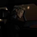
I like the image of the woman in the vehicle best. The posing of the character is good but a little blank on expression. I like how the light falls on the character but suspect it would improve with more light, brighter on her face and all those cool textures on her clothes without loosing the shadows. Perhaps light from the vehicles instrument displays and/or ambient light from outside. Try colors. To my eye this scene calls out for a cityscape background, with enough light to create a subtle back/rim light on the character. Something that would make her pop from the background. I wonder how that image would look in a 16:9 aspect ratio, that might not work for a comic panel though. That image has a lot of potential.
Sorry, I've been the type to over share and have been limiting myself to that. So i apologize if i didn't give a lot a detail. I'll give them now(sorry for this late reply as well)
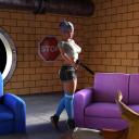
The girl with the gun was a test scene. learning how to aim light in a colourful scene. Giving her more of a harley quinn-esque vibe. Happy to eliminate someone just for the fun of it. Which is why she is smiling while aiming the gun down. I had other angles but i never saved them. Its a scene that will be added later on. Not in the same way. In more in a serious manner. So learning and postioning the camera where I can get some emotion from both models is what i was going for in that scene.
The second one, was me messing around with the lighting in a dark enviroment. in that scene, the woman is fed up chasing after a woman who is key to taking down a corrupt police force. She was hired by a high political figure in a different country to take down the corruption and put in thier own people so they can smuggle in contraban without the police force intervening. She gets a call for an update, which is why she has a blank expression. She's tired. She's been chasing the woman for a few months and nothing has came of it.
As for the suit I didn't find anything I liked until i checked my assets and found that Vic 8 pro came with it and used it. Her suit blending in the background is so she could do her assignments unnoticed. I didn't think of it until i started putting it together. I enjoyed putting the scene and story together and that was the finished product. The scene is basically expressing her own inner doubt about the overall mission with the colour scheme. The scene screams "boring" but that was the effect i was going for. why does whe look bored, why is it so dark, where is she going, what is she doing, where is she. that was the question I was aiming for. It does need a bit of more colour looking at it now, at the moment it felt right.
I didn't continue this or added more since I had to head to work. I didn't save the scene in my DAZ folder, just the image after it was done rendering. So i wouldn't be able to tell you what would've been since it was in the moment. I hope this clears up somethings within these renders and hope to get a bit more feedback. The novel im working on(which i haven't started, still want to learn more before starting.) sorta refelcts what I'm trying to do within these renders. Fun and sorta choatic but with some backstory hidden by using subtle expressions that with blends in with the background while using the camera fade effect on the background using certain colours. I know it sounds complicated but I love a challenge. I love psychology and mixing both in a scene makes a person feel a certain way. I still have ways to learn about using light probe/light effects within DAZ and with my limited time I have now, I can only do this for so long before I need to rest for work and test new ways to improve in random renders.
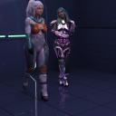
edit: as for the third image, its just me messing around and seeing what is my limit when it comes to how many charactrers can i fit before crashing as well as clothing, hair styles/colours before crashing.
edit 2: third image, I meant the third set of renders with the 2 women entering the building.
I think it really helps to have a clear idea of what the final image is going to look like when you start working. Knowing what your goal is will guide how you light and compose your image. You might want to create a mood board/inspiration board to help with that. A Sin City inspired image will be setup very different than a Boris Vallejo style poster. I suggest you spend some time looking at imagery, art, book covers, movie scenes, etc. and really study the ones you like and understand how they are put together. How are these images lit? How are they composed? What do the expressions look like? What are the backgrounds, the colors used? Then use this information to start building your images and scenes.
Lighting is the most important thing, when rendering with Iray, IMHO. I would say that should be your primary focus until you are consistently getting the results you want. For me good lighting means getting linear with the lights, emissive cylinders, rows of lights, large reflectors, things like that. But that is me, you might be better served by using HDRIs. This is why it is key to narrow in on what you want your imagery to look like, then pursue it. I encourage you to experiment with the lights as much as you can.
In visual media details accumulate very quickly, and these details either work for you, or against you in what you are trying to present. My opinion, there is no middle ground with details, they work, or they don't. An artist builds the world they are trying to show with details. Details are traditionally layered in from background to foreground. If your render is in a city, then show it. The buildings, the lights, the vehicles, the people, architecture, trash, the graffiti. Build your world so that a person looking at your image will know instantly what it is.
I hope you find this helpful.
This really helps. I have an idea after thinking about it. The best way to describe it is "Harry Potter" from Ch 1-2 vibrant to a darker tone as the story progesses. While hiding the way they feel using that. Hard to describe it when I can see it. Being descriptive is something i was good at, i will test a new render with what I'm trying to describe within the next few days. I have today and tomrrow afternoon free so it will give me some time(i will be working on it after i send this response). Using a bright/vibrant background and changing it up as if the stroy was advancing in the renders. Not my story but a whole new one.
One thing i did was doing everything at the same time. Posing/lighting and did the background last. The best way to say it; not setting up the scene and just winging it as I went along. As shown in my post. So that is what I will be working at. My story has progressed; writing form. As for the renders, its more difficult than i imagined. So much to learn and so much that goes into this that i wasn't prepared. I love it! I pushes me to get better and thats what i like.
Again, I will post series of renders to get the feel im feeling and hope what i took from your comments, I improved.
Here's a small update.
I was working on the first image but got a little motivated and ended up adding 7 more characters, just the model walking towards the edge of the steps and getting ready to call someone(using the girl in the car as a motivation for that scene) before the call.
The first and second image is me trying to fix the textures on the clothes and don't know how to fix it.
the last set is me messing with the colour scheme and trying to see which one look better. The lighting in the fourth image is the yellow tint i used in the third image to give it more of a natural look in the night as night lights on the house(using spotlights.) The firth is me changing the light to match the other 2(used 3 spotlights.) The last one, somehow the spotlights decided to stop aiming the lights down and it look good. As the scene takes place at night time.
edit: Deleted the fifth image due to forgetting the model cheeks showed. These 2 scenes crashed DAZ plenty of times throughtout the evening and throughout the night. Crashed a few times this afternoon while posing/rendering. Reuploaded what would've been image 5
I like the direction you are going in.
You might concider rendering your characters/scenes on seprate layers then assembling the final image in post. Though it is a bit more work, this will give you a little more flexability on lighting, and also enable you to fix things like blown out textures. It can be very tricky to know where to split a scene but I often find rendering seprate background/foreground/character images is faster than doing it in one shot. It leans on the hardware less.
This set of images look very cinematc in their composision, that is a good choice for story telling imagery. Those are some very interesting experiments with lighting and color, keep working at it, there is lots of potential there. You might want to experiment with emphasizing your characters from the background, this can be done with composition, color, texture, lighting, depth of field, etc. or any combination.
You are doing some good work. Keep it up!
Thank you. Setting up camera to get a certain angle is something I pay attention when playing story-driven VN.
I didn't even know you could add layers. If you you mean like photoshop(i haven't touched it since High School(11 years ago), then i have something to show you Image is from the first scene is used, the one that took me majority of my afternoon and some part of my night to fix/adjust posture, adjust clothing, set camera for all angles to get certain angles(never rendered)... wow lol things i wished i knew before setting that up and deciding on the final images to upload.
Thank you. I wanted to do more with the second set. I have the camera set up for the scene. The model stand up, the camera switches to the kidm where he notcies the blood coming from his mom and has a shocked face and starts tear up. Camera swtiches over to the man opening the door. Camera switches over kid oon the floor, not notcing the man has walked in and the gun slowly pulls toawrds his head in the same scene. He snaps back and falls to the ground. Camera switches over to the man; puts his finger back to his lips nods left-to-right and shoots the wall. Bends over and points to the strairs. camera switches to the stairs with the kid looking at them. Camera goes back to the kid just starring at the man with tears in his face. Camera switches back to the man standing up and waves the gun, gesturing him to go up. He turns around towards the door, stops and turns. sees the kid still laying on the floor. switches to a camera that is closer to the man, arm lifts up and shoots(i need get a gun firing effect), walks out the door. Camera looking at the door. Which leaves the viewer, wondering if the man killed the kid or gave one last warning shot. Same camera turns; as if the viewer is walking with the camera and turns to stare at the lady, slowly walking towards the lady who is laying on the ground in her own puddle of blood, Turns to the door and back to the body then up towards the starry night as the motion sensor lights turn off.
This was the idea but I didn't want to deal with more crashing since I had to stop and needed to go to work (2 hours before i needed too). Story telling is something I love and bringing it to life is a great feeling. So again, thank you.
Thank you. The one thats really yellow was soemthing that threw me off but I remembered I had the yellow light on on the left side and changed it. I have a few filters that i used in the (6.jpg) which uses a green-ish tint while using 1M light wiht 4500 lumen which is pretty bright and couldn't tell much from using a white filter(besides the grass being a bit greener). Besides that, thats the only thing that changed from the first set vs the second. a total of 10 hours went to these 2 sets, that includes crashing/rendering. I tired using DoF but i couldn't understand to use it since the clothing was the thing that threw me off and how pixelated(fireflies) the scene came out post rednering and decided it to keep it default. If you could help/lead me to how to layer and make it easier. I would appreciate it.
Again, thank you for the feedback. I'll post updates as I progress with the camera settings using DoF, improved lighting, fixing up the fireflies on renders.
I often find that noise/fireflies on renders are a symptom of me making bad choices about lighting. Same goes for long render times. (in GPU)
Here is an example of a layerd scene. First image is layer 1. Since there is a reflective surface that is where I split the scene. All of the reflection work was assembled behind the camera, lots of emissives placed far enough away to not have much effect on the lighting of the character. I used DOF.
Layer 2 is the background. This was assembled with the figure in place for composition purposes, then everything from layer 1, including all lighting was removed. The background props are already emissive so I did not need to add any lighting, but did need to adjust the camera setting to achieve the look I wanted. I also turned off the DOF to give me more flexibility in post. This is a real advantage to creating imagery with seperate layers.
These two images were layered in GIMP and post work applied.
Finished image.