WIP - Opinions sought on comic-style illustration
 mmitchell_houston
Posts: 2,490
in Art Studio
I'm working on some illustrations for a pen-and-paper superhero RPG. Another artist is handling a lot of the superhero fights and individual character illustrations, so I've been assigned some filler and "equipment" illustrations. I've done a few variations on the artwork, and just wanted some feeback on what style (if any) you guys like.
Keep in mind, the publisher doesn't want just realistic 3D artwork -- he wants to evoke a sense of comic book art, which is why I inked the images to define them. That's also why I worked to bring in some different colors on the weapons and equipment.
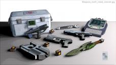

Weapons_rev01_inked_colored.jpg
1000 x 562 - 233K
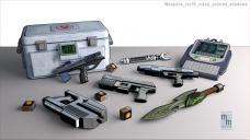

Weapons_rev02_inked_colored_shadows.jpg
1000 x 562 - 189K
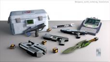

Weapons_rev03_noInking_ToonColors.jpg
1000 x 562 - 171K
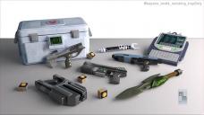

Weapons_rev04_noInking_IrayOnly.jpg
1000 x 562 - 77K


Comments
Thought I would pop in and give my input. Of the four illustrations I like 01 and 02 the best. I have a hard time choosing between these two. I think it all depends on the look you are wanting. If I had to choose just one, I would lean more toward one. I like the way the texture comic type shadows add to the weapons. I hope you get lots of input. They look great.
I think the first and second have a very nice styling. Wouldn't they have to match what the other person is doing? What have they done for styling?
How were these produced, through renders or filters? If filters, which ones, I'd be interested in seeing them.
the first one reminds me more of comics, and agree with Cris, what style the other person is using should be the one you use. Have they seen what you are doing? Maybe if they see your first render, they'll switch their style. Nicely done!
Thanks for the comments!
I've seen the other artist's work and am working to match it within reason (in other words, I don't need to mimc his style so that my work looks exactly like his, but they should be complementary so that they're not jarring -- this will also help that he's doing a lot of character work and I'm doing gear, vehicles and stuff like that). I actually think No. 2 matches his style the best -- Inked outlines and soft shadows.
However, I kind of like the "old-school" look of No. 1, that has the strong halftone shadows. I really just wanted some feedback from others, since what the publisher likes is the version we'll use.
====================================
Cris Palomino: These were produced with heavy postwork in Photoshop. I started with the Iray render in No. 4, and then manually outlined the items on separate layers. I also had renders without the ground (I had both 3Delight and Iray renders), so I just had the items floating in space, which made it easy to duplicate just the individual items and (on duplicate layers) adjust the colors to lighten and intensify certain colors. I then combined the various layers with different blending modes (Overlay and Multiply, being the main ones used). The halftone shadows (in No. 1) were created by duplicating the base iray image (No. 4) and applying the Halftone filter to that layer in Photoshop. I then set the layer blending mode to Multiply.
FYI: I worked with a HUGE base render. Since this is for print, I actually rendered it at 4500 pixels wide. That will let the final image be printed at almost 600 dpi (it should fit across the entire bottom of a page in the 8.5 x 11 book).
1. The shadow jumps out at me stronger than the image. If you liked this I would say make the colour grey and not black and feather the edges just to soften the shadows a little.
2. I like this one best.
3. Too realistic 3D
4. Too reliastic 3D
If you add your own halftone dots, you need to be careful about the halftoning screens used in printing. Otherwise you may get obnoxious moire patterns. You might need to work with your publisher and their printer to find a screen and angle that doesn't conflict with your toning style. Generally, though, printers prefer not to do anything out of the ordinary, as do publishers, because of added setup costs.
Tobor: You are basically correct, and if I were printing this on an old analog press I would have a little concern. However, the simulated haltone screen in my illustration is so coarse that a moire pattern is extremely unlikely (I would even hazard to say that it is almost impossible on a modern digital press). That being said, do you have a preference for any of the versions shown here?
Of the 4 options, for a comic book I would choose example 1; rev01-inked-color, because of the coarse halftone dots and the more saturated colors in the image themselves.
Even on a digital press they may apply gradation in ways that can produce artifacts with regular and repeating patterns, and I've seen instances of these interfering with applied halftone shading of the type you've used. However, usually you can see those in a soft proof, and the more modern RIPs handle this better than older ones. Anyway, sounds like you were aware of the issue -- hate the thought of someone doing all that postwork, only to have a printer rep tell you it wasn't going to fly!
As for preferences, it's usually the human characters that act as stress tests for the stylistic approach. That's really where any of the examples will shine or shrink, so I'd reserve judgment 'til then. That said, for comics, I usually prefer the comic-book-look, so #1 would be the style I'd try to develop. However, that is just me. I did, note, though, that the halftoning of the shadows only seems to apply to the ground. The shadows cast from the gun onto the crate, as well as crate latch, don't appear to be toned. That caught my eye as being a little too "computerized." But again, that's just me.
I'm a cartoonist at heart, so I tend toward number one. It has that 1970s smeared, cereal-box press look that makes me think of being a kid and being excited about comic art. Two has a cleaner, 80's 90's comics look. The last two are nice renders, but they don't have the jump of 2, or the ambience of 1.
Tobor:
I won't be doing many (if any) character illustrations for this project (I have two illustrations in mind that have characters, but I may cheat and use mostly silhouettes and distance, so they won’t be very detailed). There's another artist handling the character illustrations, and his style is different (but complimentary) from what I'm doing. Since this is an RPG book, the publisher agrees with me that it's okay if our two art styles don't match 100%. After all, I'm not trying to imitate him -- just provide some additional art. For sections like the gear, vehicles and settings. Maybe not the most exciting stuff, but it’s still fun in its own way.
Thanks again for mentioning the moire pattern. You are 100% right – unless I’m careful, that could be a problem. I’ve worked with this publisher before and I’m familiar with how my work looks when printed, so I’m confident that this pattern is coarse enough to mitigate the moire pattern problem.
And – EXCELLENT CATCH on the shadow on the box. I completely missed that one. I will go back and fix it. I may also tweak some of the colors and lines to give them a flatter look. I don’t want to go for a really old comic book look (as in 1940s or 1950s), but I think a little more work is needed to nail down the retro vibe I’m looking for.
aggromemnon: Excellent news. The publisher just approved Look #1, so I'm going to play a little more with the colors (and fix the shadow on the box) and then I can move on to the next illustration.
Thanks to everyone for their feedback.
Here is the final draft of the illustration.
TOBOR: Thanks for mentioning the halftone shadows on the box. I fixed them today and am going to call it quits on this illustration. Although I would love to tweak the colors some more, I'm just out of time.
BTW: If anyone's interested, I've got another image for the book posted over here. I'd love some feedback on it, too.
http://www.daz3d.com/forums/discussion/comment/987735#Comment_987735
I think these turned out great, mm. The halftones (is that the right term?) look great and you fixed the box so it looks a little more cohesive now. That one was my favorite of the bunch. Nice job.
The clean lines look fantastic! Keep 'em coming . . .
- Greg
Greg: Thanks! The lines were actually added manually. It was the only way to get the look I was after.
I'm with you guys, though: I do think this is the better of the two illustrations, so far. It just has a clean look that's very appealing.
Someone suggested I just ammend my currnt topics, rather than creating new ones for each illustration. Not a bad idea.
Here's a very rough of the next (and probably last) illustration I will work on for the Powers Beyond RPG. I'm actually pretty happy with the robot and the creature. I just need to work on the background, and add a little hatching effect to the console.
DANG IT. I just realized that I shaded the wrong side of the robot! I'll have to redo that tonight so that his shading matches his shadow on the ground.
Okay, I fixed the shading direction, and added background shading.
Any thoughts or reactions?
Boy, that really makes a difference. At first, I thought you changed the lighting, but I think it is all shadowing from the shader. I like this second version. I think the console and the walls fit in much better with the rest of the image. Very cohesive.
KM: Thanks! Looking at it, I realized that I had not added any shading to the "box" to the right. I've called this one "done" and sent it into the editor.
Looks good!
I like #2 the best.