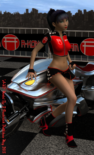
Team A-KON
Here is an idea I will be running by the folks at "Phoenix Entertainment" for a staff character next year. The Concept is "Team A-KON"
I Introduce A-KO for Team A-KON


A-KON_Grid_Girl.png
1214 x 2000 - 3M
You currently have no notifications.
Here is an idea I will be running by the folks at "Phoenix Entertainment" for a staff character next year. The Concept is "Team A-KON"
I Introduce A-KO for Team A-KON


Licensing Agreement | Terms of Service | Privacy Policy | EULA
© 2025 Daz Productions Inc. All Rights Reserved.
Comments
Ok here is another shot, I am much happier with the pose and lighting
I like the second one better too. Suggestion: You might want to add a distant light front, to act as a fill. Her face is still rather dark IMO. Try 20% then work your way up? I really like the way her hand is posed on the vehicle, the fingers have a wonderful bend and seems quite comfortable for your character (who is really cute.)
Thank you for the tip. I will give it a try
Ok I have been playing with the lighting and shadows.
I introduce for these experiments "E-SO" (Copyright 1999-2015 Raymond F Bradshaw) that's me BTW
E-SO was created for the "Mixx Online" Design the Project A-KON 2000 Mascot contest
This is her 1st appearance in her new 3D form The lights were way to strong in this shot
I had to back the #2 spotlight all the way back to 35% the 1st shot was defaulted at 130%
Ok I have used the advice you gave me, I think it worked. Here is the result
Yes, she looks much better! :)