Heart of Art
 deleted user
Posts: 1,204
Hi guys n galls. Normally I shy away from showing my renders. But I'm looking for advice on self improvement as well as to make a few friends.
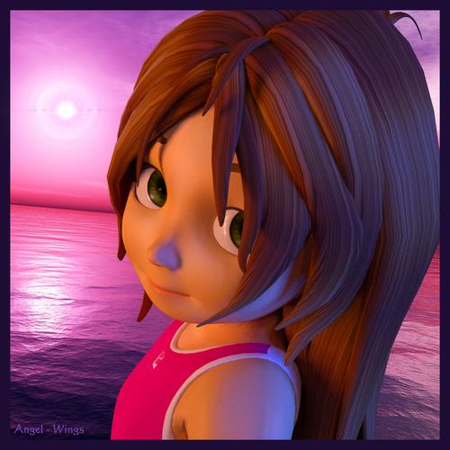
I did have a gallery page but it's no use to me as I don't get hardly any real feedback on what I did right and what I could have done better. I'll start this page with something I did a few days ago.


Sadi_R4_med.jpg
1500 x 1500 - 1M


Comments
Nice Render!!! Flower Girl....
I like the expression of your characters face...Reminds me of my niece, right before she says "REALLY Uncle?" Haha
Welcome to Art Studio. :)
I love the innocent expression and the tilt of the head really draws in the viewer.
If you want suggestions, one I might make (and it's only personal preference, not anything wrong) is to tone down the purple on the nose. It's a bit intense IMO and draws the eye to the nose instead of her eyes. It's also a lot stronger than that on her arm. How is that happening? I know this is an artistic render, and that purple on her nose is coming from out of scene, to our right- I might consider toning that down a bit.
Also, the light in the background is way behind her, but the main glow is coming from our left. It doesn't match the color of the light (aka purple) as it seems orangish. So the main problem I have with this is the main light source not matching the strongest light, and it's an outdoor scene so it's not likely another strong light source (orange) would be casting from our left.
That said, I really like the color combinations and it's totally up to the artist what light sources they want to use. It's a very, very appealing render so far as composition, the color scheme, and the fact you have part of her head going out of scene.
I'm being picky as you asked for input. :)
hehe. Thanks your inout.
I added the blue and orange light source to spice up the render.
I know it was unrealistic, but it made the render stand out from the crowd so I decided. Meh, why not? xD
I also made this just about an hour ago. I like to do scenery renders a lot.
It's supposed to be near sunset on a smoggy day in an old town.
I understand, and I've done that too. It's what makes it art! As I said, I really like the color scheme, excellent choices.
I wasn't really satisfied with this one. The ambiance didn't come out right. Even though it was a Dimensional Theory lighting set up.
I didnt like the shirt either. I fought with it in Zbrush for about an hour trying to get to to warp right.
Leaned some tricks in the process though. Even though this render ended in failure I still learned some things.
This is Abby by the way. Shes a genesis figure. My little angel. It took me 6 months to model her.
She started out as a test subject for GenXed K4 morphs but a month later I found myself really going to high detail.
Goofing around with morphs.As time passed, she grew on me, and I decided to make her one of my main actresses.
I intentionally made her teeth not so perfect because in my view it adds a personality to her face.
The Second picture is one I did right after I concluded her face was finished.
I wanted to see what she would look like in Daz, as I normally render in Lux.
I got a better idea. So I'm not taking extra server space. I'll upload it to my gallery and link it from now on.
Anywho. This is my new render. Any comments, critics, or questions are welcome.
http://www.daz3d.com/gallery/#images/51827/
I really like your cityscape. What I think would connect the viewer with the scene as opposed to it being distant, would be to throw a phone pole with a bird or a street sign on it in the fore-ground to contrast the distance. Could be something as simple as a stray tree branch or something peeking into the edge to give a visual cue... Not that you are asking for advice, but just an observation.
:)
-Rak
Didn't think about doing that. I'll give it a whirl next time. :)
Here is my newest one. Any feedback would be welcome.
https://www.daz3d.com/gallery/#images/52390/
I like light blur х)