January 2021 - Daz 3D New User Challenge - Composition, Instancing, & Duplication
 DAZ_ann0314
Posts: 2,860
New User's Challenge - January 2021
Sponsored by DAZ 3D
Are you new to the 3D World? Are you at the beginning stages of learning 3D rendering? Have you been around for a little bit but feel you could benefit from some feedback or instruction? Have you been around awhile and would like to help other members start their creative journey? Well then come and join the fun as we host our newest render challenge!
Back by popular demand (or well because we think it went well LOL), we are breaking down each month into 2 different challenges:
A Beginner Challenge and then also an Intermediate Challenge.
So which "Challenge" should you choose?
Follow the Beginner Challenge if you are:
- New to the New User Challenges
- New to Daz Studio
- Newer to 3D Rendering in General
- Or if you have not participated in the January Composition Challenge
Follow the Intermediate Challenge if you have:
- Participated in the New User Challenge for awhile
- Know the basics of Daz Studio and would like to learn more in depth topics
- Been using 3D Rendering Applications for awhile and feel comfortable with learning Intermediate Topics
- Or if you have all ready been spotlighted in the January Composition Challenge
*Please be sure to list in your post which Challenge you are participating in*


Comments
Beginner Challenge:
"Composition"
This is a general render challenge with the focus on how you compose your image. We are providing you with lots of great links on Composition from a variety of sources. Composition is key to pulling a viewer into your image and leading their eye to where you want them to see things. It is a fundamental skill that we, as artists, not only need to learn, but will continue to hone over the years. Read about and look at the examples, in these articles, for how composition works and how artists, from the Masters to people like you and me, put these compositional guidelines to use to make our pieces more appealing and invite the viewer to look around your image as you intended.
General Composition Rules:
http://design.tutsplus.com/articles/5-fundamental-skills-every-artist-should-master--psd-28054
The Golden Ratio:
https://holycrop.wordpress.com/tag/golden-spiral/
https://designschool.canva.com/blog/what-is-the-golden-ratio/
http://www.hongkiat.com/blog/golden-ratio-in-moden-designs/
https://www.youtube.com/watch?v=8A3JnWzgXGk
Some Tools for DS and Bryce:
Golden Rules Camera Prop v1.5 by Jaderail
Golden Rules Composition Helpers for Bryce by David Brinnen and Horo
Artists, filmmakers and photographers share similar traits in how we present our work, so you will find that a study of the art of photography will help, which is why you see various links to photographic articles included.
Photography Composition:
http://digital-photography-school.com/5-elements-of-composition-in-photography/
http://digital-photography-school.com/5-more-elements-of-composition-in-photography/
Color can be used as a compositional element, especially when you have color contrast. Here are some fundamentals on color:
Color Fundamentals:
http://www.tigercolor.com/color-lab/color-theory/color-theory-intro.htm
Other Types of Contrast:
http://photoinf.com/General/NAVY/Contrast_and_Framing.htm
Examples of Composition:
http://www.cybercollege.com/comp_ex.htm
http://www.cybercollege.com/comp_ex2.htm
http://www.pinterest.com/dawnshiree/rules-of-composition/
Examples from Netflix's The Queens Gambit (The Director of this series did an EXCEPTIONAL job applying the Rules of Composition):
The Queen's Gambit - the photographers perspective on framing and composition
Composition of The Queen's Gambit (You may need a Facebook Account for this link which directs to a post - be sure to scroll through the pictures as there are TONS of excellent examples)
This is a bit of a long read but offers excellent examples of different kinds of composition and camera angles.
The Cinematography of "The Incredibles"
Prior Composition Challenges:
January, 2020
January, 2019
January, 2018
January, 2017
January, 2016
January, 2015
Daz Tutorials
Scene Set Up Tips
I will be checking in as will the rest of the Community Volunteers to try and help with anything you all may need.
For a list of the current challenge rules, please see this thread : Challenge Rules
Closing Date: January 31st 2021
Intermediate Challenge:
"Instancing and Creating Duplicates"
This is a general render challenge with the focus on using Instancing and Duplication within a scene. We are providing you with some links on the topics from a variety of sources. Utilizinging Instancing and Duplication well is key to creating intricate scenes while saving on file sizes and processing power. It is a fundamental skill for those wishing to do large battle scenes, those wishing to create their own worlds, or those wishing to create an environment that seems full and complex.
*If participating in this Challenge, please be sure to list what item(s) within your scene you have instanced or duplicated*
General Instancing and Duplicate Creation Information:
Node Instances
1. Click on the item in the scene you wish to Instance
2. Go to Create - New Node Instance (Good for Singular Instances)
or
1. Click on the item in the scene you wish to Instance
2. Go to Create - New Node Instances (Good for adding Multiple Instances at once)
Pluses:
Doesn't use as many computer resources as loading in the items again (So it won't show as more Geometry Loaded in if you look at the Scene Info Tab)
Great for filling in a scene with items that are going to look identical while keeping the computer strain down.
Can Populate a scene fairly quickly
Minuses:
All the items will share the textures of the original item.
Node Instances are an exact copy of the original, they cannot be morphed or posed separately
Duplicate Nodes
1. Click on the Item in the Scene you with to Duplicate
2. Go to Edit - Duplicate - Duplicate Node(s)
Pluses:
Creates a copy of the Selected Item
You are able to change textures, manipulate, repose etc as if you added in a new copy
Minuses:
Doesn't Save on Computer Resources since it is basically the same as loading in a second exact copy (Rig, Bones, and All)
*Duplicate Node Hierarchies *
(Duplicates the entire node tree below the Selected Node)
Example: If you select Genesis 8 that has clothing and hair attached then it will Duplicate Genesis 8 as well as the attached hair and clothing.
1. Click on the Item in the Scene you wish to Duplicate
2. Go to Edit - Duplicate - Duplicate Node Hierarchies
Pluses:
Creates a copy of the Selected Item and all items attached to it. (Great for creating a copy of a Figure with included clothing, accessories etc)
You are able to change textures, manipulate, repose etc as if you added in a new copy
Minuses:
Doesn't Save on Computer Resources since it is basically the same as loading in a second exact copy (Rig, Bones, and All)
Generally you want to use Duplicates or regular full figures with varying poses etc in the forground of the scene and then use the instances more in the background or as scene filler where it will be less likely to notice they are the same (especially useful when using Depth of Field etc) It can also be used to help cut down computer load when you actually want or need to identical things (props etc) in the scene..such as two chairs in a livingroom, two tanks (or 20 tanks) on a battlefield, multiple candles in a scene that are all the same color, books placed on shelves, potion bottles that can be moved to various places across the scene, or things like trees and grass.
Examples of Using Instances and/or Duplication within Daz Studio:
Instances used for the Spectres that are Attacking Ater Eterwood
(Special Thanks to Totte - Code 66 for the Example)
Instances used for the Crates and Barrels. Barrels were rotated to avoid the repeated look.
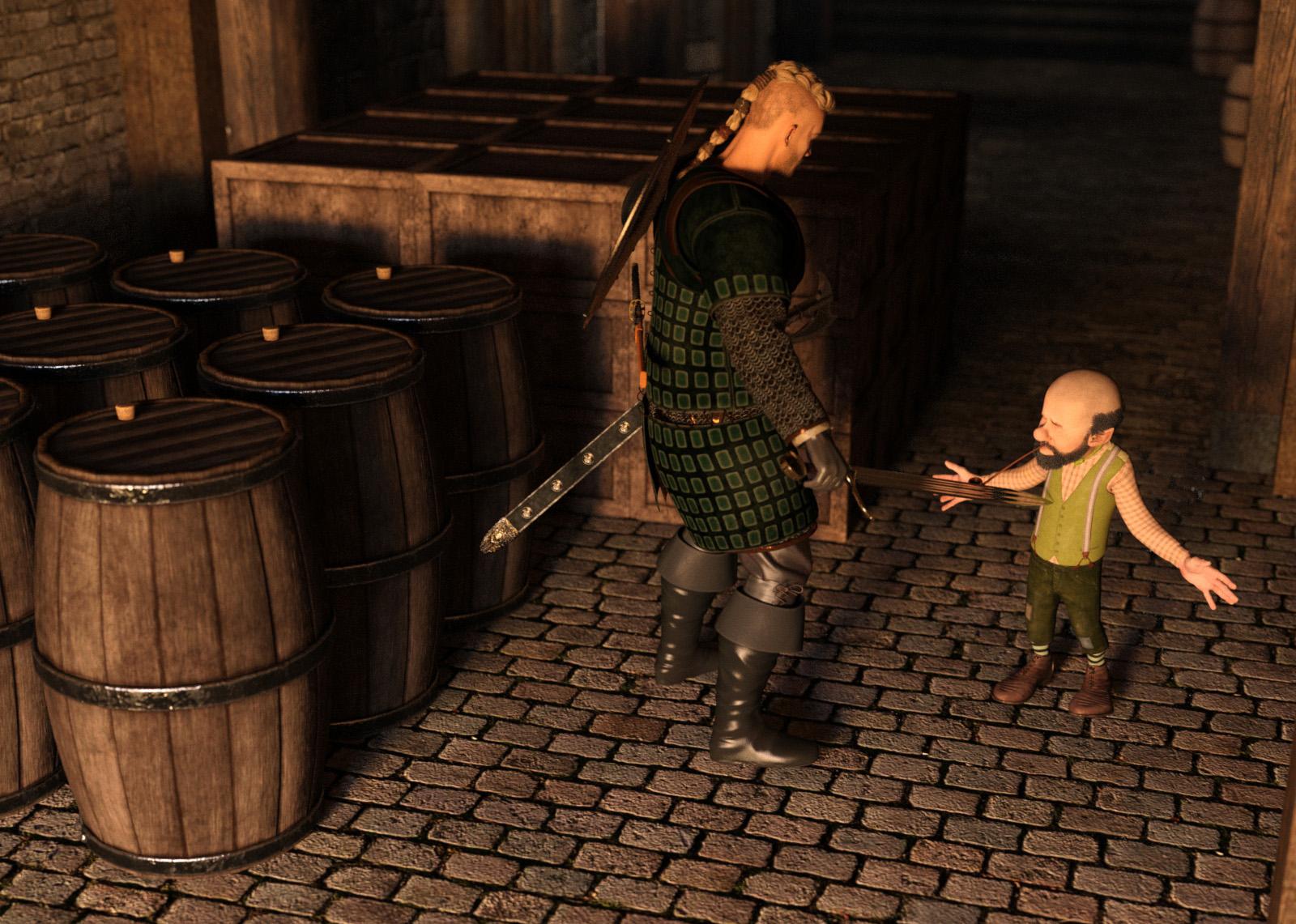
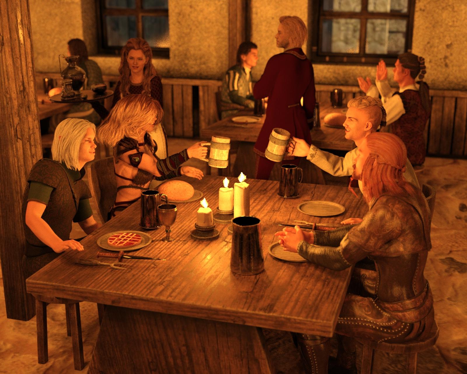
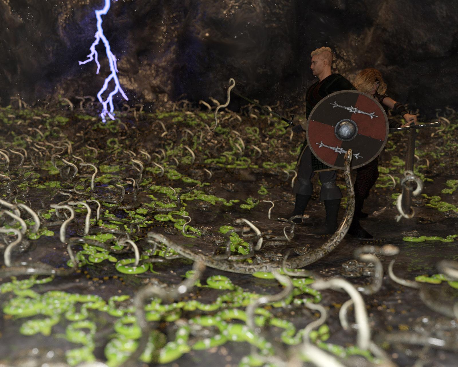
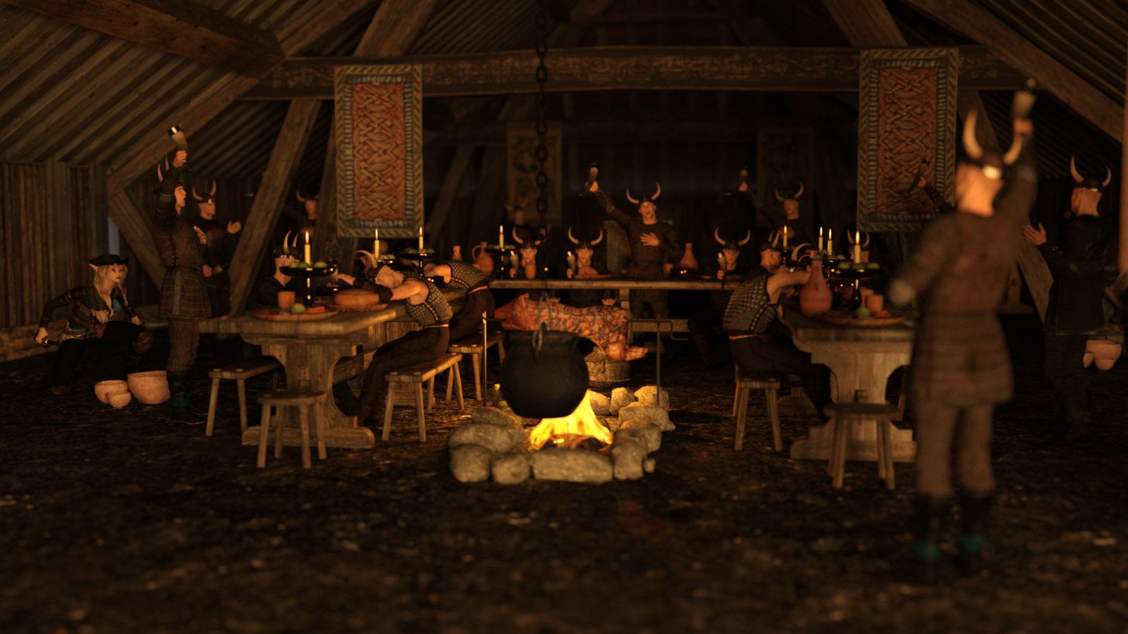
(Special Thanks to Totte - Code 66 for the Example)
Instances used to add more Patrons to the tavern
(Special Thanks to Totte - Code 66 for the Example)
Instances used to add more snakes to the image
(Special Thanks to Totte - Code 66 for the Example)
Instances used to add more Vikings at the feast
(Special Thanks to Totte - Code 66 for the Example)
Instances created Using UltraScatter on the to create a ball of Skeletons as a trap in the tunnel
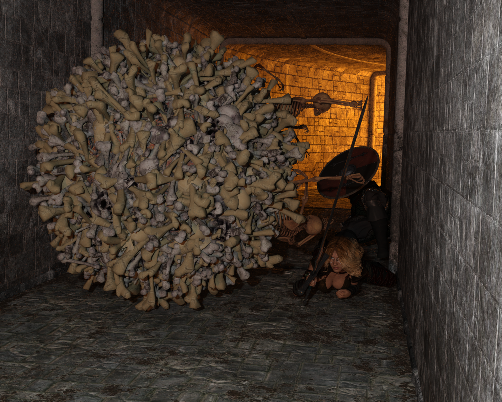
(Special Thanks to Totte - Code 66 for the Example)
Instances created Using Stack'Em Up on the Containers
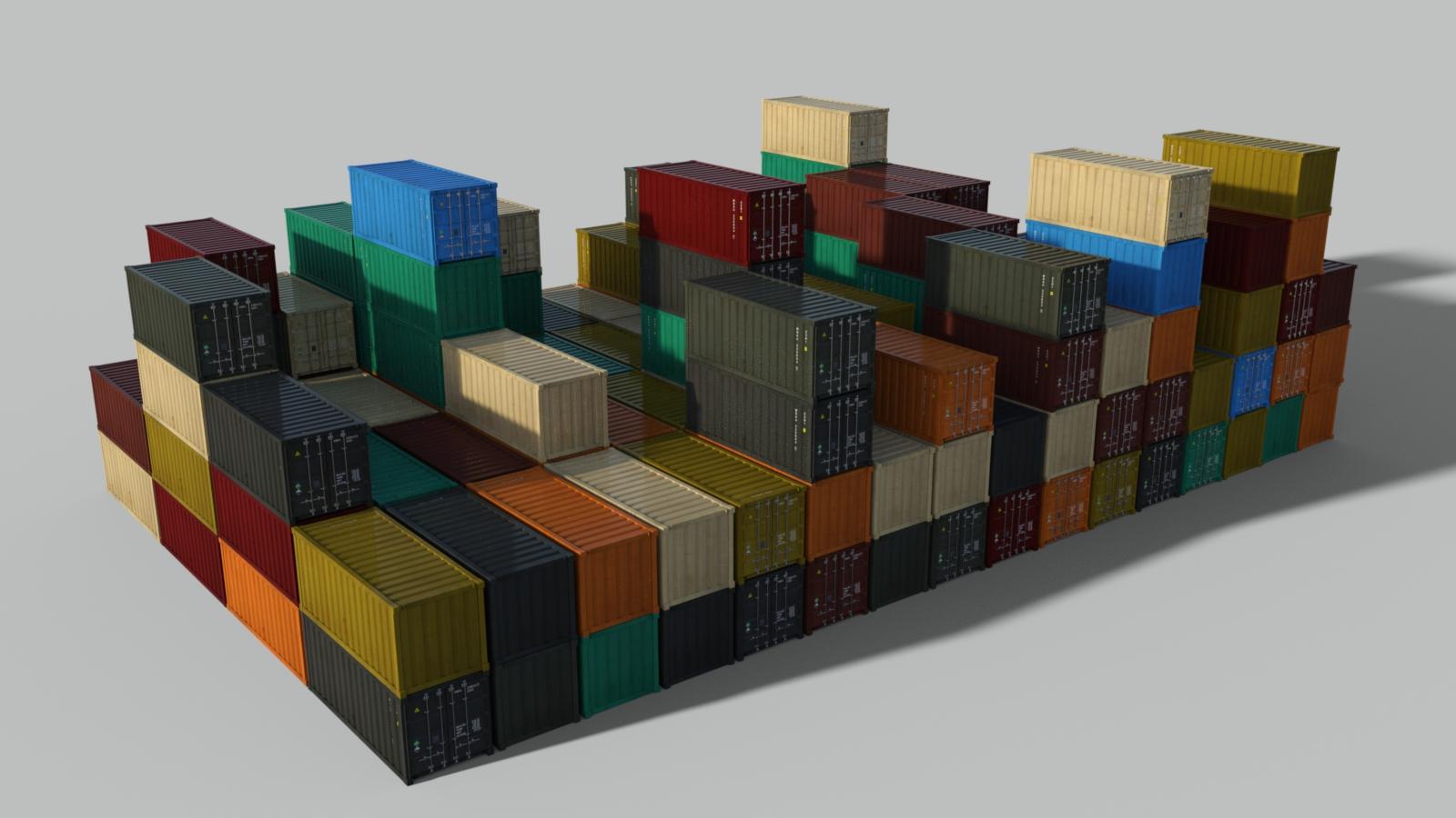
(Special Thanks to Totte - Code 66 for the Example)
Handy Products to Use while Instancing:
Stack'Em Up
UltraScatter Advanced Instancing for Daz Studio
UltraScatter Pro
Instances Plus+ for Daz Studio
Prior Composition Challenges:
January, 2020
January, 2019
January, 2018
January, 2017
January, 2016
January, 2015
I will be checking in as will the rest of the Community Volunteers to try and help with anything you all may need.
For a list of the current challenge rules, please see this thread : Challenge Rules
Closing Date: January 31st 2021
I've gotten started on what I'm thinking of for the intermediate challenge. Not quite ready for the first render yet, but I'm working on it.
I've attached an example of a render that I did for a prior challenge back in October of 2016 that I used instancing in as an example of how I've used it myself. In this case to have more dancing cyborgs doing the thriller in perfect time with one another. The source cyborg had the aniblock for the full dance applied and the rest are the instances (don't ask where the source cyborg is in the render all I can say is that they are in there.) I'm simply sharing this trip down memory lane in hopes that it inspires somebody.
Anyway I'm planing to use instancing for something along the same lines for what I've got in mind this month.
Here's my start.
So far I've got three instances in use here.
First shot at the intermediate challenge. Used instances for the background androids while the one in the centre is a duplicate. Feedback and suggestions would be appreciated!
Title: Unique
Ol Jeb Fogs the Orchard
Intermediate Challenge: Version A
I used instancing to build the orchard.
Ol Jeb: Weird West Bundle
Orchard and Tractor: On the Farm Orchard
Backdrop: Mountainscapes Backdrops
Sky: Skies of Economy Redux Volume 1
Lumberjack Outfit: The Brute 8 Pro Bundle
On to Version B...
Just did this yesterday - first time using focal ranges with the camera in Daz. Lighting and positioning definitely intended to highlight and understate a few items :) Composition!
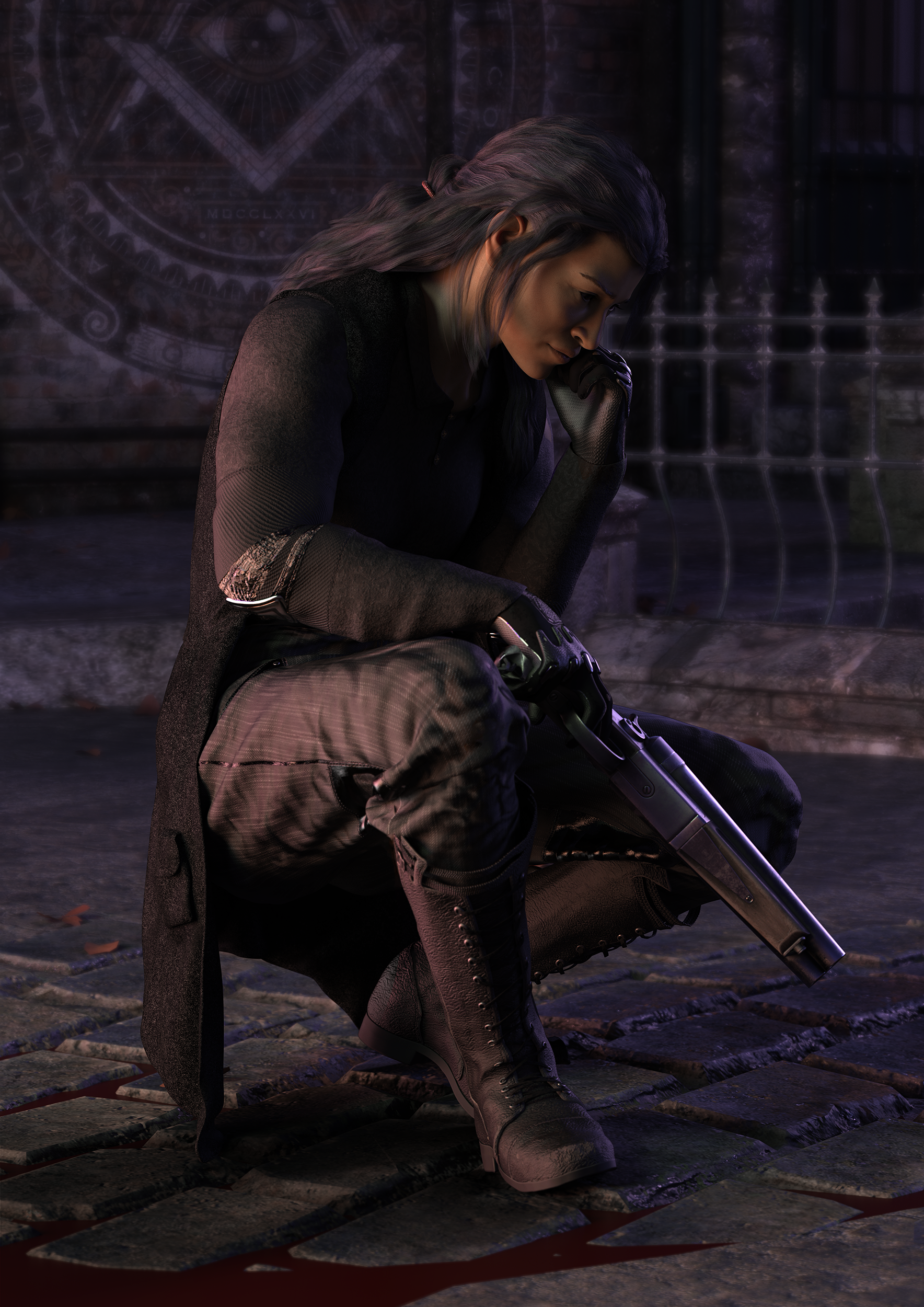
Set is The Streets of Steampunk
Boots are from Alliance Defense Outfit
Shirt is from from Alpha Team Outfit
Pants are from Cyber Decker Outfit
Gun is from Western Guns
Gloves are from Solar Wardens
Hair is Orson
Skin is Alama 8
Figure Morphs and other tools used include:
Transgender Shapes
SY 200 Morphs
Super Natural Brows
Darius 8
Fergal HD
Holt 8
Jing for Kwan 8
Landon 8
Vernon HD
Version b here. More cyborgs on the ground, and a trio of fighters in the air. Still need to do texture work.
This is my entry for the intermediate category. The flowers are instances. Constructive feedback welcome.
This is my entry for the intermediate category. The flowers are instances. Constructive feedback welcome.
version c here starting in on the retexturing that was needed.
I really love all of them so far. I don't have tons of feedback at the moment actually other than to keep refining as many of you are. You are all doing a really wonderful job
Title: Caaaake....Caaaaakkkeee.....
Software: Daz 3D
Challenge: Intermediate
Trying out the intermediate challenge this time round. Feedback much appreciated!
The instances are the gravestones and of red panda figure, Ping.
Tried a couple of versions, one at a later time setting.
7pm:
8pm:
Probably something in between or if you choose the darker setting, think about some highliting your character in front.
I like the use of instances you tried here, but in the current way it doesn't get entirely clear if that group is following the one in front of just standing and gazing. it's probably not simple to convey motion with that plushy
also check if you have a solid connection to the ground with the stones and the character, it looks to me like they are floating (shadow missing?)
looking like a nice flowery meadow place. Maybe think about what story wou want to tell? Did she come there to pick flowers? is she meeting someone (she looks a little like that)
you got me hooked with the character design and the story you're telling here, very good start!
You're using and intersting light setting as well, but I would like to see a little bit more in the scene, so maybe you can give a little bit more power to the two lights. also you could add to your story if you give us a clue if he used that gun (bit of smoke maybe or some more items on the floor he examines?) just suggestions, looking forward to see more.
That's a neat idea!
Question, could it be you composed Jeb and his tracktor to the orchard in post? In situations like that you need to take a close look on the light settings, in the orchard the light is coming from the right, the shadows of the trees are falling left from them, Jeb and the tracktor are ligthed from the front left. that makes the two parts not belonging to each other as much as they could, so try to adjust that, see as well that you get the same light quality (diffuseness, intensity, light tint, for iray light temperature)
lovely variation of a classic, I like as well that you stayed on the grey palette, this might get an additional touch with a very carefull placement of some bit of colour.
Hi. Intermediate Challenge.i have two.
Monolithe and Littke Unicorn. Feedback welcome.
Thank you for the feedback. The only postwork was compositing the multiple layers together. It is likely that I tweaked a light setting in-between layer renders. I will keep an eye on that in the future. I cannot usually get a whole scene to render in one shot due to my obsolete equipment.
On to Ol Jeb version B:
I did some surgery on the tractor. I used some shader on the tires and the lights. I did not want as much shine from the lights because it is a daylight scene. I used the Iray rubber shader that is in Daz by default. Even though the tires are barely visible in the scene, I also retinted the rear light, which is also barely visible (sigh). The last tweak was replacing the original warning beacon with a scaled Emergency Lights Galore strobe. This is not a finished render, so there are blemishes...
So I moved some things around here, conducted a few experiments, and broke some stuff. I was able to render all of this in one pass (except the missing sky...).
I know I need to fix the floating barn on the left and the poor lighting on Ol' Jeb. I also need to reframe the shot a bit.
But I have some questions and I would love to hear some opinions:
Is the color of the mountainscape confusing (aka what is the brown spot nest to the mirror)
Should the shadows of the leaves be less sharp? (Currently using a distant light but would a diffuse spot be better?
Do you see the Bee? Ha ha. There is a bee just for fun.
On to Version C
Have a great day everybody!
Ol' Jeb Version C
For Version D, I need to rotate a tree to get a branch out of the tractor cabin and I need to translate my "Dust Box" back a bit.
Hiding
Doing duplication and some instancing for the intermediate. Went through a couple of concepts and settled on this one. I had to play with the points of light a bit to get the flame looking more realistic.
Constructive feedback appriciated.
Amy
Hi Amy,
I like your concept and your attention to detail on the flames paid off.
I must say that the first thing that caught my attention is the "hovering" figures. I think this shot would benefit from having the guards' left leg forward in the step. As it is, the cloaks are hiding the legs so much that they appear to be absent. The effect is somewhat jarring to the senses, because, I know there are supposed to be legs there. A little arm swing would also add to the effect of movement (I am assuming they are marching, but maybe they are just standing there as it currently appears...).
I look forward to seeing your next render.
Regards,
Ed
Version 2 I have added some more flowers and put one in her hand to show that she has come here to pick flowers
Thank you for the feedback Ed.
I adjusted the legs and arms on the guards a bit which will hopefully improve the overall composition.
Amy
O'l Jeb Fogs the Orchard Version D
Render time 25 + hours (finished over-night).
Fixed some things...broke some things...sigh
Ahh, feet! Now all is right in my universe. Now, if you do not mind a little more advice/criticism from a newbie. In DAZ where you show/hide your aspect frame, do you have your thirds guide showing? I would take a look at your scene with the thirds guide on and try to make sure your intended focal point is on one of the lines or an intersection of the lines.
The changes you made in your lighting from the original shot is a nice improvement.
Looking forward to seeing your next render, Amy
Regards,
Ed
Thanks for the feedback, Linwelly. I've added a glowing light in the centre android's chest to add a little colour. Also changed their necks/back of their heads so they look a little more more robotic.
Second entry for the Intermediate Challenge. Used instances for the crowd of cultists and duplicates for the snakes (can you find all three?) Feedback appreciated!
Title: In the Serpent's Lair
Version 2. Just realized that her hand was on the wrong side of the bowstring for her to actually draw it (oops). Fixed now!