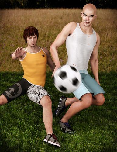
Feedback pls if you have a moment
 Tako Yakida
Posts: 548
Somehow my images always turn out dark, so I lighten them, but never sure of how light to go. What do you think? And I'm thinking I need to adjust the dude on the left's foot a bit since it's kinda looking like he's spraining his ankle.
Thanks in advance.


scramble.jpg
1000 x 1300 - 489K
Post edited by Tako Yakida on


Comments
The lighting looks nice. It looks bright because my monitor's brightness is set too high. I can't figure how to lower the brightness. I like the motion blur on the soccer ball. The ankle of the man in the yellow shirt does look odd. Maybe you can bend it up a little bit so that the foot looks more natural.
Thanks for the feedback! What model monitor do you have? I might be able to tell you how to lower it.
To my eyes the Left figures pose is off. I see his off screen foot as also in the air, aiming for the ball in fact, his on screen foot in this pose is not set to take his weight as his weight shifts with the off screen legs movement.
Thanks Jader. I agree. He might be about to fall on his arse with the current foot setup. Of course, that might be a valid occurence under the right circumstances... Anyhoo, here is a test render with a new foot position. (I did a quickie rather than wait 10 hours just to show the foot with a real render).
How's this?
Better but I think it is too planted now. Maybe more of the heal down fully, foot not set down fully yet and a small bit of upper curl to the toes?
Edit: Keep the just off balance look to the foot some too as the weight shifts so would the foots angle its too set now. IMHO.
Yes, those feet can be quite shifty. ;)
Revision 2:
That looks just about right. I drew a force line all the way through now and its a very good curve.
Awesome possum. Thanks!
Now if only I had mocap....
Tip for you Tako, look into Comic book hand drawing, the use of force lines now comes second nature to me. They help get a nice fluid pose going and often will show which pose has more power or impact to a viewers eyes. That and just about 8 years of classes I never used in my real life. Silly of me but I swear I planned to be a artist and not a Pro retail manager way back when.
Hello,
color wise I like the first one, but I think what matters when it comes to screen graphics is how much light your screen has, specially now with flat screens. The first one has in my opinion fuller colors (Do I have to say my images also turns out dark sometimes), specially on other screens with low light. I try to keep mine calibrated, but I know how much a screen age on just 2 years time, not to mention 6 or 8 years, even expensive screens. Cheap screens can never keep the calibration, they change on a weekly basis. I have some no name flat screens, works for terminal work but that's about it.
Different screens are calibrated at different gamma or use different white points, it's a mess, but what I try to say is without proper color syncing your image will only look as you designed it on your system, for everybody else it will look different.
Good idea on force lines Jader. I'll have to input that into my neural dataport asap. I work in logistics so yeah, I feel for you on the artist thing. Personally I wish I had more energy to be creative, I'd be rich!
I know what you mean about monitors Totte. I thought about buying a datacolor Spyder calibrator but decided it wasn't worth the effort.
Anyhoo, here is the real version 2:
I like it. I gives me that What would I see next thing. That to me is a sign of a good image, if the viewer gets involved.
Tako- for me, with what my screen is showing, the man on OUR right is washed out. Might I ask what light you have on him and what intensity? Also the color? You might try a bluish gray or a mauve to darken it up a bit.
on my system your graphic looks fine. if I was to try anything I think I would change my lighting map to Ray-trace and then from there do as Novica suggested and try adding color to the lighting. But first try your Ray-trace light setting and see if that makes any differences. Ray-trace setting and lighting give a more sharper shadow and defines your render image more.
that may alleviate some of the color wash out. because right now it looks to me you either have your light settting at Deep shadow map or not set for shadows at all which will definitely give your image a washed out or it a flat 2d look,. shadows will define your image so I would start there. : Good Luck
Hmm.. it could be me but I think it is using a Uber Enviro Lighting set up with soft shadows as I do see them properly. I just think mr man on the right is very light skinned and was meant to be light skinned. I do catch some mesh grass poke through on the feet but the Polygon Group Editor, now the Geometry Editor Tool in the Beta, could fix that. The shadows fall on the mesh grass properly and are broken up by the mesh but to me they look correct.
Thank you Jader, Novica and Ivy! Yes, my shadows kind of suck I suppose. I rendered it in Reality so used planes turned into lights called "mesh lights". I know how to make the shadows sharper but usually I err on the side of too soft since I hate black shadows. It's a matter of finding the proper balance.
The guy on the right is Nevil from Renderosity, and his texture map is painfully light-colored (except the legs), making balance difficult. Of course, I have futzed with balancing the colors of skins in photoshop before but haven't gotten around to it too much with Nevil. Originally his legs looked like lobsters compared to his face so I did some editing at least.
Have you tried changing the skin materials in the Surface tab, in combination with the lighting and hue changes in PS? (And you're WAAAAY ahead of me if you're doing Reaility. I'm just a DAZ-er, so hopefully I'm not offending you with the suggestions. I don't know what you know re D.Studio :)
Reality does import the surface settings for most of the options from DAZ Studio, but I find it easier to change them in Reality, which then saves those customizations. I do need to look more into skin settings in general. It's been a while since I have studied them.
In the meantime, here's a new render I would like feedback on. The pose is from one of the i13 sets so I don't need critiquing on that. ;)
Hmm... which figure is the model? I may a have a tip or two on easy settings to up that body shaping posing (read bends) if the right figure is used. I like it as is but the its not a real figure sort of stands out to me because of a few bend areas. For stand alone like this I want that just a bit more most of the time.
It is v4. The character uses an unusual kind of morph so I can't genX transfer it.
I remember some V4 fix morphs for bends sold on renderosity but I never looked into it.
Ah yes the Good ol' V4. Yep fixing her is a bit more involved and cost a bit of cash. In that case I have nutting to offer. The Image looks good as is to me. I was thinking V4 from the clothing as I have that set myself and Find it renders well in most engines with few tweeks.
Thank you Jader.
The reiver/raiver clothing set is pretty awesome. Nice and shiny works well with it. :)
Next we have here good ol mr hyde. I wonder if he's still popular.
I like Mr. Hyde looks to be getting into a fight with someone...nice renders....Trish
Thank you Trish! I'm glad you like. :)
Here's my next one: