Epic Sci-Fi Starship Battle Kit [Commercial]
 acharyapolina
Posts: 726
So currently i am working on Epic Sci-Fi Starship Battle Kit.
It is a collection of 6 different starships with three different HDRI backgrouns for rendering. Also included are 2 sets of laser beams and an explosion prop with a Debris Or Sparks prop.
Each starship comes with three different colour material presets.
Here are some images. Any critasism is always welcome. thanks. :)
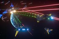

scene1.jpg
1000 x 667 - 389K
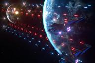

scene2.jpg
1000 x 667 - 385K
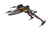

Starship1.png
720 x 480 - 263K
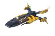

Starship2.png
720 x 480 - 264K
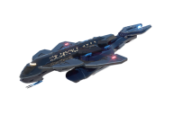

Starship3.png
720 x 480 - 205K
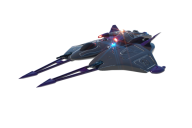

Starship4.png
720 x 480 - 201K
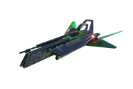

Starship5.png
720 x 480 - 201K
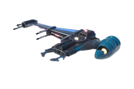

Starship6.png
720 x 480 - 223K
Post edited by Chohole on


Comments
This looks good! May I ask what bloom settings (under render) were used for the renders with the laser fire?
Hi, thanks. Currently I use the daz Octain renderer plugin, but you can get the same results in the daz iray renderer if you play with the settings a bit.
the settings i use most of the time in the daz iray are.
bloom filter radius. 0.020
bloom filter threshold, 50000 or higher
bloom filter brightness 0.020
the brightness and the radius can be played with go up or down depending on the scene lighting and what objects have the emission material applied to them.
you can also play with the brightness scale of each indivitual onject. for example. the brightness of the windows is only at 1000000 but the brightness of the engines is 5000000
Also the colour you select for each object also effects how it looks, as whiter objects need less brightness and darker objects need more.
Wow, thank you! Some very good advice there!
Here is another scene created by the kit. :)
I can always use more starships and the overall set looks nice, but I really love the design of the first ship . It invokes a feeling of the Bird of Prey, but the wings on the back remind me of the ships from the 80's Buck Rodgers show.
Looks great
I'm happy you all like it. do you think the starships need more detail or are they looking good the way they are?
I think they look good as is, especially since the objective is to make a "space battle kit" where we are seeing multiple starships from far away, usually in the darkness of space.
So I decided to add some Asteroids to the kit as well. that way you can make the outerspace more realistic.
Darn, was hoping this would be a modular kit allowing us to create our own spaceships, but I like these, regardless. :)
Only thing I'd suggest for any future such products, would be turrets which can swivel and elevate. Space doesn't require things to be aerodynamic and I imagine future military ships would be bristling with turrets to give them all 360-degree coverage.
I actually think my main reason to obtain this will be those beam lasers and explosion and spark props. Those look very impressive.
Looks really interesting! As I'm working on an illustrated novelinvolving some starship battle scenes, I'm quite interested in this. Some suggestions, if I may?
- Shields. In Trek, we often see bubble shields that surround the vessel. They become visible when hit with something. Those would be cool.
- For the laser or phasers, maybe take a look at how Babylon 5 did them. Many times, especially with the Vorlons, there was a deeper colored inner beam surrounded by a slightly lighter outer beam. Think of a beam within a beam. You didn't see it often, mainly with the huge cutting beams, but it was there sometimes. It would add some diversity to the beams. You also sometimes saw some halo, strobe and glow effects from their firing positions. Those can be added by the user from other products or in postwork, but I thought I'd mention it.
- Mebbe add an escape pod or two. Missiles or torpedoes?
- Debris.
Looks grat, can't wait!
Bob
Now that it's been released, it's sitting in my cart :)
My first experiment with this kit; used the bloom settings mentioned by @acharyapolina, plus denoiser at default settings and gamma set to 3.00 (Burn Highlights was set to 1.00 but I can't remember whether that's default or not.)