Another world of mine... Homes Brothers
 Dolbomir
Posts: 73
So I decided to try a single panel comic style of storytelling...
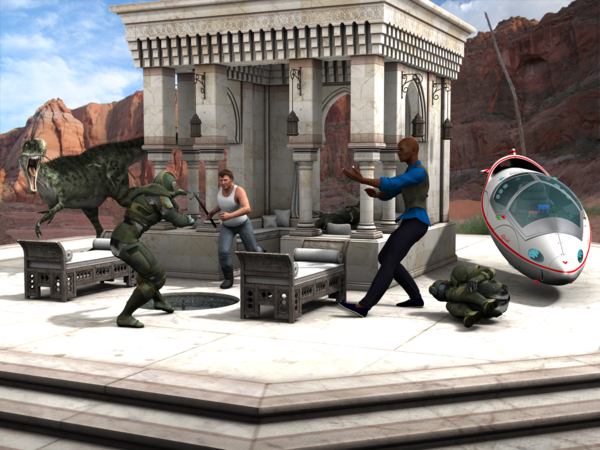
So here are the Homes brothers: Joseph H. Homes, a construction specialist that favors medieval weapons as tools, and Detective Bartholomew F. Homes, PhD. (in a-- kicking)--who wrote a dissertation on how to turn an opponent into quivering jelly by skillful displacement of several bones in the pelvic area. Or something like that. It's way above my head, tbh.
Together, they fight crime in the city of Haven't Named It Yet--colloquially referred to by its locals as Haven (or Haven't if they want to emphasize the general state of affairs in it).
Here's an intro render I did, entitled An Ambush, to introduce the heroes... still need to add some word bubbles and whatnot.
...I'm still looking for a better texture for Bart.
Might redesign both as M6/G2M or something.


Comments
Okay. First off, let me tell you I'm going to tear your render a new one. Second, it's a perfectly good render as is, my tearing it a part is just help I hope. Third, yes many of my renders fall into most of what I'm about to say, I'm a failed art teacher and never see my own errors until another points them out to me. Remember I have said it is a perfectly good render as is.
1. The dead tree behind the transport is not needed and draws the eye away as it is a light color over a dark area. That can be fixed by removing it or by balancing the scene with more dead trees so the one off color bent line does not draw the eye.
2. As many do, even me, you have gone the way of look at everything I set up in this scene when that is not needed to tell the story. It is simply a need most have so all the work put into a render is shown. This gives the render way to much dead space for the eyes to wander off on.
3. None of the Action, is placed on any of the Golden Rules points. Thus the viewers eyes do not automatically fall on one of the two main areas of your render. So it has no focus at the first look.
I suggest you PULL in on the scene with the Camera, study the different golden rules of composition and get the action of the main figures, the brothers, to be the main auto focus. Many of the rules have more than one focus point. I hope you take this as meant, helpful, and not a attack on your art. Also note I do fail in most my art as well on many of the same points. But should know better.
First, welcome to the Art Studio threads. So happy to have you! :)
I like all the action in the scene. What do you want as your main action? The fighting or the dinosaur? A couple tips, if you're interested. I like the overall feel of the scene, you have it packed with action, and these ideas are just to pick your brain. :)
1. Consider making the dinosaur bigger, for more of a threat.
2. Your curled person is floating, he is not on the ground. I always put my objects/people through the ground plane then zoom in and slowly raise them up. And, to check for floaters or people going through the ground plane, tip your scene upside down and see if anyone is poking through.
3. IMO, the spaceship isn't needed, as you need to zoom in on the action. That's just a personal opinion though.
4. Your lights might be a tad too bright as you've lost detail. My rule of thumb is that if I lose lines, my scene is too bright.
Good action poses- now what you have to do is recognize you have a dark skinned character and bring in special lights for his face. Try a spotlight just for him, shooting from the front UP so you don't shine down on the ground plane. If you do, and have a graphics program, just use a dark color and take out the lightened area around him. He seems a bit lost in the scene right now and lighting would make him pop back into the action :)
5. You've got a dark green dinosaur against a dark green outfit of your character. Perhaps move your dinosaur to our left so there is a gap of scenery between them.
I do like that you don't have a lantern coming out of the characters' head, one thing though- with that dark skinned character's hand, it gets lost against the dark background. If you move him a step or two backward, both hands will be in front of white marble columns. Just watch that lantern!
I like the background scenery, I think the red cliffs highlight your main set quite nicely. Your characters sound like fun- let the adventures begin!
Cool! So much feedback at once! Thanks :lol:
I was trying to match the light of the background, but I can see what you mean... Hmmm... style-wise, if you're representing a bright day, how do you find balance between the fact that a bright day actually would obscure some detail and be too bright and the fact that you don't want to obscure detail or have your scene too bright? Aside from not rendering bright daylight scenes that is...
EDITx3: Wait, you mean light him up without lighting up the surroundings or something? Do you have an example by any chance? Not sure I follow.
I wonder if advanced spotlight can be used here to only light him up and nothing else? Haven't played with that yet.
EDITx3: Ek. Good point :lol:
I like the background scenery, I think the red cliffs highlight your main set quite nicely. Your characters sound like fun- let the adventures begin!
Yep, I was trying to both make sure no pieces of background seem to grow out of the actors and to conform (apparently unsuccessfully) to the rule of thirds composition. The red cliffs were meant to contrast the white structure the action is going on in. I'll try to keep it even if I'll go the route of changing the scene to the bros' approaching this structure on their respective transport--although the angle may be tough to keep.
Thanks!
Sometimes folks don't know that when you select a LIGHT as a view (instead of Perspective) your view becomes the light. You can set up what you want to light using Perspective view, let's say you zoom in on the face, then Create>Spotlight> and in the popup, select Perspective and your light will shine on whatever you have in your Perspective view. (Name your light SpotFace first.)Then use the view dropdown (where it says Perspective) and select SpotFace and now when you move around in the viewport, YOU ARE THE LIGHT. You can go to Parameters to SpotFace and change the intensity, and actually see it in action over in the viewport.
Tip: Make your light a bright fushia (hot pink) when you first experiment, and turn off your other lights. You'll see what that ONE light is doing.
Ahh... the Failed part. I was a long time art student, every class possible from Jr high, Commercial Art in high, and yet more Commercial art in Jr Collage. In my part of the world, deep US south, at the time I wanted to teach, I could not find a community art class to assist in which was needed as part of my credits for my teaching certificate. It was why I went into freelance art. I then learned that like art classes my part of the world had more artist than jobs for artist. I moved on and had a happy life but let the art go so long that Arthritis got my hands before I took up art again. With 3D art I'm able to get my ideas out but it's not the same as pen and ink as I was trained and studied to do.
I did notice that one of the thirds feel perfectly on one characters head, but in art you can chose the first focus. For me I would have had it fall just forward and a bit below the face so the viewer took in not the face but the figures action (pose). That would have given the Arms and Face the focus giving the viewer Action as the first impression instead of the person. The same type of focus could be done for the other brother, in the rules the closer the focus point is to the object the better. To me the Action should be the focus, that would then make the viewer want to know more about the two figures in action.
I could not tell from this image that the Transport and T-Rex were meant as part of the team. If this is going to be a series of images that is something that could be played up in the next render or so. But I understand now it is explained. In art that would be hard to imply in just a image without more interaction with the figures.
The dead space thing. It is natural for all humans to roam the eyes after a focus to take in everything. So the open space to both sides and the top and bottom of the image is just dead space. Only there to draw the eyes away from what should be the focus, which to me should be the action of the two brothers. Drawing the camera in closer and keeping the eyes near the main focus or focus points will give the image more impact and less to distract the mind. Keep the viewers attention on the action and offer less things to look at. Like OH that's a pretty background over there. At that point you've lost the viewers interest in what you want them to see. I often use a Depth of Field blur on background images just to keep the viewer from wandering off on details not important to the image. I think you did well with the man on the floor, I understood it from my first look.
I hope you don't mind but to me JUST cropping the image like this gives it MUCH more impact. I can and will remove this if you want me too.
For the failed art teacher part, it seems there are always more artists than the demand appears to be for them... The few artist gatherings I go to nowadays where I am (midwest US) seem to indicate that too. I've been interested in art for as long as I remember myself, but my laziness and practicality were both always against that motivation... That is, I either don't seem to have the time or am too lazy to seriously learn. I'm trying to fight that--this time by venturing into 3D (although I occasionally still pick up writing and my attempts at drawing/painting). Pen and ink actually sounds like what I try to better myself in, but I tend to resort to digital equivalents to save paper and ink.
For what you described and the cropped shot (no worries about doing it--and actually thanks for the hands on example!), that seems similar to what I ended up. I think, I'll try blurring the background to see if that makes a difference.
I tend to go backwards, it seems, when assessing a picture--first try to take in everything, then focus on whatever stands out.
For the transports, that's why I was thinking of making the intro image one where the two brothers are actually riding their respective transports going to the location instead of this action scene. This is intended to be a series of images--specifically, a series of one panel comics.
Here's my second attempt. I've tried to make the action fill up the shot this time around.
Key changes:
- Moved Bart (the guy in blue shirt) closer to the camera. Now both brothers should be on the 1/3 and 2/3 lines and hopefully he stands out a bit more despite his skin and the background being oddly similar in color.
- I tried the light in the face thing but I don't think it worked in this render (takes my poor machine a couple hours to render, so it's always a guess as to what would come out).
- Changed to 16:9 aspect ratio to spread the actors out, particularly the dinosaur (really need to give him a name ><) and the remaining green goon.<br /> - Changed the angle a bit in an attempt to make the foreground be a bit more in line with the background and to ensure the lantern isn't growing out of Bart's head
- Changed dino's position to make him look more like attacking the remaining goon (the idea is the dino and the bros should look converging on him)
- Attempted to put all actors roughly into the middle third of the whole image
So, now the idea is to take in the whole scene, then focus on the bros (as they're on the 3rds). For Joseph (the curly one), the intersection of the lines should be on his face to draw to his facial expression. For Bart, I was trying for the line to be a bit in front of him to draw on his whole posture (if that makes any sense), so, I think, similar to what you said.
I think, this version incorporates most of feedback so far?
To my eyes you have hit it all on the mark with this one. If I was going to change anything in this one at all it would be the face light. It works as it was meant too, but to my eyes it's set just a little bit to bright. Remember Spot Render set to a NEW Window will really help when setting up renders.
EDIT: I understand the writing thing to. It seems most artist have that text bug too.
Turning the light pink as you are positioning it helps you to see where it is when you turn on the other lights one by one. Then change it to the color you want it.
The scene is better- but you have the column horizontal line right on the guys head that is wearing the white tank top. Depth of Field will take care of that.
The dinosaur appears to be charging the tank top dude- as if attacking. If he is supporting him, rotate it a bit to be pursuing the dude in green?
Much better :)
Thanks :D
I've tried re-rendering this at a bit of a higher quality, but my PC is no longer good enough. Waiting for my new PC to arrive... And contemplating upgrading the Homes Bros to Gen2...
Need a good texture for Bart (the guy in blue shirt), too.