Show Us Your Bryce Renders! Part 4
 Dave Savage
Posts: 2,433
Come on people... get posting so we can get the new Show us Your Bryce Renders thread started.
It doesn't seem like two minutes since this one started, it has shot along at a great pace and is stacked full of great renders.
Seriously, look in some of the other sub forums and see how the Bryce renders compare so favourably.
Just in the last few pages, we've had Dan's excellent Stonemason competition pic which is composed, lit and rendered to perfection.
Guss's Wings 3D object rendered sharp and colourful (I feel left out with the Wings 3D stuff because I've never downloaded it, maybe something to fix soon, but I fear something that will eat up my time).
Mermaind's lovely looking silver trinkets (more Wings 3D grrrrrr!!!!!)
And a great selection of renders from TLBKlaus, the last one being my favourite because I for many years I had more than a passing interest in flying saucers.
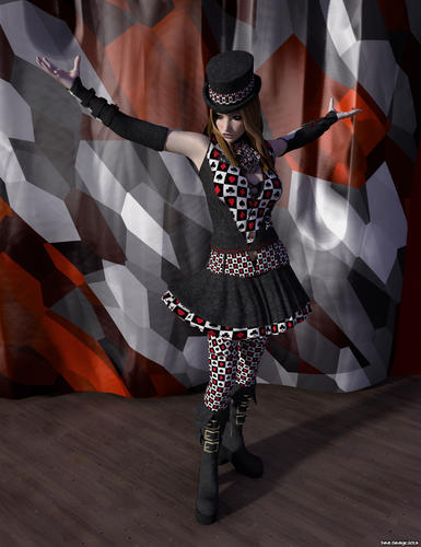
Here's my latest... There is another version of this cooking at the moment which I think is an improvement, but I'll probably wait for the new thread to post it. :-)


Comments
Well I have been trying like mad to get my lightning to look like lightning, and it doesn't. boohoo
@TheSavage64: The lady has a nice dress. Hm, I am not quite sure, but I think the curtain is the same fabric?
@Chohole: Your litghning looks not bad, really not bad.
Is that Skull Cove? looking good.
Is your lightning Bryce or post work?
I've tried to make fork lightning as a model and failed miserably in the past (yours looks much better than mine ever did).
I ended up deciding the best way is to get a photo of lightning and placing it on a 2D vertical plane and using the material and mapping options to make it look right.
Maybe as another material challenge, David could make a convincing material to map on to a 2D plane? ;-)
At Electro-Elvis: The backdrop uses the same colours but it's made from a terrain object placed vertically with the Misc/Fabrics/Patches 2 preset material applied (with its colours edited).
Impressive, particularly to see Bryce being put to practical use. The video's downloaded very quickly, so I guess they are only small, which explains the low frame rate. The textures on the models look very exciting!
That link has been on my Raytracing > Tools list since 2004 ...
Oh yes... but if it is that old... will it still work? I will download the demo and see what happens.
Since the website has started working for me again - it was terrible earlier for some reason.
Jamie and mermaid010 - well done with following the tutorials, the results look spot on!
TLBKlaus - another selection of stunning renders - if only we had a gallery you would be dominating with all this output! I like the portals particularly.
Dave and Pam, well, brilliant as usual, but in different ways... so what's all this about lightening? Looks pretty authentic I think though, maybe if it was a photo the scene would be darker due to the lighting causing the aperture of the camera to shut down?
OK I spoke too soon, the websites stopped working again...
That link has been on my Raytracing > Tools list since 2004 ...
Oh yes... but if it is that old... will it still work? I will download the demo and see what happens.
UV Mapper Classic is a fantastic free application, I highly recommend it. I just upgraded to the UV Mapper Pro and I am very pleased with the decision. As far as what I have been reading online even to this day there are few other applications with more powerful UV mapping tools than what UV Mapper Classic and Pro can provide. The most recent UV mapper version was released in 2011 or something, so its not so far removed from the markets of today. It is a solid app.
UV Mapper Classic is very simple, it doesn't really give you an idea of how in depth the full Pro version is. Hope this is helpful info.
Thank you Rashad for the endorsement, yes most helpful to know when trying to pick between so many options out there. I'm giving it a try right now. So far so good.
Cheers,
David.
@Dave - lady render looks great!
@Pam - excellent lighting - in nature, they would be more blurred and with a halo around them. Minor quibbles, though.
@David - the link is old but still works and points to a much newer version.
It seems finished from the point of view of the tutorial. The material has a nice specular response. When you turn off the sun it seems to be missing something. It might be beneficial for the image to crop it a little bit closer, lower the reflection of the floor and use stronger ibl, ta lighting.
What's all this fuss about now?
Today I watched a tutorial on the UV mapper in Wings3D and it seems like it's not too complex.
Even easier as you already know the quirks of Wings3D.
I downloaded it today and have had a little play with it.
My first foray into vertex modelling with Wings3D reminded me of the first time Johnny Vegas came to my attention... he was doing pottery on the radio.
And as the thread was unexpectedly split sooner than I thought it would be, I'll post the alternative version of the girl in the groovy outfit.
The coordinated backdrop was OK but I thought it needed a contrast to pull her out a bit, then I decided to give her something to do.
What's all this fuss about now?
Today I watched a tutorial on the UV mapper in Wings3D and it seems like it's not too complex.
Even easier as you already know the quirks of Wings3D.
I downloaded it today and have had a little play with it.
My first foray into vertex modelling with Wings3D reminded me of the first time Johnny Vegas came to my attention... he was doing pottery on the radio.
OK now I am torn, UVmapper and Blen... ahem, Dwsel's suggestion, and now Wings3D - which would be super if possible because as you say I like wings anyway. So can you point me to the tutorial? Then I can be really wondering which way to go. So much software - my poor old brain cells can't take it. I've turned into the kind of person who can't walk from one room to another without loosing either his glasses, his keys or his cup of half drunk coffee. I think I've used up all my RAM :( Nice render, once again, though you must be tired of me telling you this, you have a real eye for composition.
I can't remember which actor it was who said "the only thing worse than people writing stuff about you is people not writing stuff about you" (paraphrased).
Does anyone get tired of positive comments? :-)
I figured while I had a correctly Brycified V4 in Bryce, I'd make use of her.
@mermaid: Your last image in part 3 looks fantastic. Love the look of the wings objects.
@Horo: Thanks.
@Dave: Both of the stage images look great, though I do prefer the first. I think the colors of her outfit contrast better with the color of the curtain in the first image, making her stand out better. In the second image she seems to meld with the curtain. Still, real nice images. And speaking of real nice images, that closeup is stunning. If it weren't for David, I'd not know how to produce those type cubes. I still feel more like the smart monkey than the guy holding the hammer and chisel. And for your first Wings object, nice looking pitcher.
@Pam: Really like that image. And as to the lightning, from the various strikes I've seen over the years, nothing wrong with what you've created in that image. I've even been too close to that one bolt in the foreground.
@dwsel: Losing the shadow in the third image does change the look. Still, it is rather pleasing in it's own way. I did experiment with lower reflection and saw it darkened the entire image, especially the infinite plane. But it was just a whim to see what resulted.
@David: Thanks.
Hmn... moody... great composition, but without SSS the only thing I've found so far that helps with skin issues is to provide very uniform bright white light from all around using TA - this seems to trick our eyes into not looking for SSS and then you are left concerning yourself with properties that Bryce can perform - so you can include then a specular gloss from a specular light (doesn't have to cast shadows - needs to be very subtle). Anyway, that's just what my fumbling experiments have shown so far.
Dave, I'm going with your tip for UV mapping first - Wings3D - because it's the devil I know - and it is free. If I can't work that, I'll try Dwsel's also for reasons of freeness. And failing that, the final offering, which will leave me poorer than a European depositor is going to be after the banks skim their accounts down to the last grote.
Oh new thread :)
So, this is a WIP, since I'm not entirely pleased with the final results. This will certainly benefit from higher rays per pixel, but I wanted to see the final result that didn't take a full day to render. I'll certainly be back to this one in the future!
64 RPP, True Ambience (TA Scattering Correction), Soft Shadows, Blurry Reflections, Depth of Field, Reflection Correction, Lit with an HDRI and the Bryce Sun. Models from archive3d.net and Google 3D warehouse
I call it "Read'Em and Weep"
David, You could do a lot worse than using Hexagon's UV mapper even though I use Wings I like to tidy up in Hex.
Do you use this version of wings ? Manifold Lab Plugin Collection it has many more features.
Er... no and you are not the first person to point this addition out to me, but I've yet to try it. I suppose shall have to at some point, but does it change the Wings interface much, because given that I already have Octane on the go adding more to Wings as well might just be too much to take in at the moment.
Looking good MrSilus, I've been playing cards quite a few years now and I've only every had this hand turn up once in a Texas Hold-um game. The next significant hand I was against was four aces and a king - that was a nice win because Mr four aces was pretty confident of taking the pot I can tell you. The look on their face, it was priceless.
Oh, Dave, OK skin testing, since I've been talking about it. Here's a test with a model found at a link kindly provided by Graham Dresch.
http://graphics.cs.williams.edu/data/meshes.xml
Some cool models here to test your render engine with.
Here's a five minute obscure lit render with a bit of Bryce sun for backup. Note that the fill in from the obscure sphere of white can't really go any lower than this because of lack of SSS and also, even now, you can see mesh smoothing issues.
Here is a short video to accompany this render. Bryce 10 minute scene - Lighting Skin Experiment 1 - by David Brinnen
@MrSilus - nice setup. You already know about the noise. The gals and the liquid in it diesn't convince me. But as you say, it's a WIP.
@David - thanks for the video. Good start, Obscure Lighting has its merits.
@Dave - the lady with the hoops is great.
Here I've done a side by side (Bryce left, Octane right) for some reason that I don't know, the Octane HDRI has turned up black and white.
Full size image, if you want to view it, is 2000 x 1000. The Bryce render took 15 minutes. Octane I allowed to cook for 40.
I've done an over and under comparison of a failed SSS test idea I had.
Top one took 10 mins, bottom one took 2 hours 20 minutes.
Very nice test, the effect on the bottom model is excellent. SSS is possible in Bryce but... for skin, very find control is needed, the rays need to be absorbed and scattered just below the surface, to give the right impression of density. Your material here would be too translucent for skin I suspect - though it is a very good effect.
Yes, it was just an avenue I was going to go down because I believe node based shaders use a trans map to determine the SSS. I was wondering if transparency could be used to map the areas which need to let a bit of light through. My next step was going to be to create a UV map for the wings shape and allow that to control the transparency to see how that worked.
After waiting for over 2 hours for a low RRP render at a very small size, I'm not sure I have the patience to continue down that road, especially when even if it works it would be almost impractical for a high quality render.
Besides, I think Wings models are especially suited to using transparency in this way as they are solid, whereas a Vicky model is made up of part mesh objects, so I'm not sure that method would translate to a human figure correctly in Bryce.
@David - the specular on the Bryce render is not consistent, in the Octane render it is. The colour of the HDRI and on the faces is differently interpreted. Perhaps the Bryce one is not tone-mapped. Also, we have usually Ignore tone mappig enabled, perhaps it gives off more accurate light it that control is unchecked. The Octane render is not sharp.
@Dave - this is an inetersting test. And now that you mention it - other renders often use specular and bump maps separately, probably also for other effects.
Yes, Horo.
I've been looking at some pages on modelling and texturing faces. It seems several different texture maps are required to layer the effects.
An example
Another example that uses the same model head David is using
It's not beyond Bryce's capability to use this many different maps to control the various aspects that need combining to get realistic skin.
The main problem always being that as soon you start to use transparency, the render times get silly, but I'm quite sure that the combination of a good SSS map (which really don't require small detail but more blurred edged areas) and the correct balance of volume and transparency colour, it can be done... if you have the patience to wait for the render to render. :)
These are impressive results. The second image in the second link shows the translucency of the ear nicely.