The Stellacaster Guitar and Poses for genesis 3 [commercial]
 Navi
Posts: 452
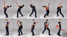
Hello, here is a small preview of a coop work, made with Td3D, who created the guitar.
It's an original design, with plenty of customization options (basically each and every guitar parts can be tweaked to your taste, dozens of material presets available, plus shader presets for parts you would like to tweak with different colors).
It comes with 16 poses, 8 for males, and 8 different for females, and most of the hands are available as partials, to make it easy to tweak/build your own poses. All left hands are hierarchicals, so the fingers will always stay posed right in place on the fretboard. And it's very easy to tweak, just move the hand (bend, twist or side-side), or the forearm/shoulder, the guitar will always follow the move.
There are plectrum smartprops too, for male and female, they work on any of the playing poses.
https://www.daz3d.com/the-stellacaster-guitar-and-poses-for-genesis-3
Here are a few of the pictures :


Comments
ps : Not sure if it is just me, but the pictures get a lot of jpg compression artifacts, when viewed on the forum. It's weird, they're 100 % clean by default Oo.
All the images are sharp here.
Really ? They look all blurred, in my browser (Firefox), with plenty of artefacts in some areas (like if they were re-compressed). Was wondering if I shouldn't replace them with the png, but thank you for the info :)
Wait, there is something going on, when I check the info on one of the picture, it says 123Kb, instead of 850 for the real one, so no wonder why it look dirty. I'll try to find another way to display them properly.
I'm using Opera.
I'm using Chrome and all the images look perfect.
Laurie
looks fine in FF here. not a fan of the guitar style, prefer classic styles myself. Also needs a strap, but do like the poses, so may get it for those, especially the partial hand poses.
The poses are very nice. The guitar looks strange, but maybe is just my taste...
Why have those blade-like fins presenting a sharp edge where the player's left hand would go to reach high notes? It is impractical and would be dangerous on a real guitar. They look knife-sharp. Also needs a strap, you could not play it like in those poses without a strap.
Thank you for the honest feedback. Glad the poses are well received. I hoped that they would be. Navi did such a great job on them. I knew the design of this guitar would take some getting use to though :) I am very traditional in what I play also. So why this design? I guess there's always a need to offer what isn't the same-'ol. Besides, it got hard to make musical sci-fi images without my characters looking "trapped" in the 1950's, Though this one could easily lend it's self to something eccentric in a moderm age image. There are so many guitars in this world that are just plain dated or attached to a place. Saw the recent release of a UFO crash product. Could one imagine Elvis walking away from that wreck with a Stellacaster in his grasp? Only thing "dated" in that image would be perhaps his outfit (and the fact it's The King, himself maybe) :)
A strap? Great comment FSMCDesigns. I just had no idea how I was going to make one work. Dynamic props are just beyond my skill leves atm. Have a friend though who used a dynamic one made for Michael 4 during testing. But I would welcome anyone to offer one up. A generic one for all guitars would be outstanding!
I strongly believe it's guitars/props like this that will inspire our kids to climb way outside the box and get even more creative. That's what it's all about right? Encouraging creativity. That's what motivates us all I guess.
In my opinion the vibrato-bar/bridge system looks very retro and dated. The main design of the guitar is appealing. It looks like it would have a nice feel and balance. The fins at the neck-heel area are not ergonomic, though. A tool or instrument should never have dangerous handles or operating surfaces. This is a design flaw on many 3d swords, too. Looks cool, but decorations that injure the user are not good.
Thank you everyone for the feedback about the pictures, in fact I checked and it does the same on all pictures posted in the forum (it re-compress them, ie. a 850 Kb pic will turn into a 130 Kb one, average). I was surprised when I noticed my pictures were looking "dirty", in comparison to the same pics on the PC, but there is nothing we can do, it's just the way forums are handling jpg pictures.
Thank you for the comments about the set, too, yes the guitar has a style of her own :) , that's actually what I liked when Td3d did show it the first time :) . That's not the way it is supposed to be used, but you can hide some parts, with the opacity slider in surface tab. Each guitar part has it's own surface, so no need to add new surfaces or anything to tweak it to your taste :) .
Edit : I've lost some of the original png versions it seems (3 of the poses lightboxes missing), but I post that one, as it looks much better as png on the forum (difference mostly visible on the picture parts that are in focus) :
Good observations Connatic and fair comments. I did do a lot of weighing up on the practical and asthetic aspects along the way. I guess Gene Simmon's "Axe-Guitar" was a reasonable example I leant towards in thinking about ergonomics and any perceived danger factor. Seriously, I have made plent of guitars with aluminium fins that are less sharper than the thickest plectrum on the market. Like this thing, they just look imposing. As a general responce to those fair concerns, this guitar was never going to be played by real hands. With that in mind, I had to seriously consider the asthetic component, as I believe most 3d sword creatorts must also. It is after all a fantacy guitar, that will find it's home in an image and not a realworld stage. The dated tremolo? Yeah, guilty. But hey, it's hard to improve upon that which is by design, completely perfect! :) Chrome fins, wings and tremolos... it needed some retro appeal. Thanks for your honest review. It all allows for an even better design next time round.
Thank you Navi. I absolutely forgot about that "hiding" feature in the surfaces. Exactly why I made so many surfaces.... to any unwanted bits :)
No problem Td3d ;) , actually that's what I used to make some of the folder thumbs. Simple and it works :)
think it looks interesting pity no strap does it come with that pick? being a hard rock and heavy metal fan see a lot of interesting looking guitars many have sharper points than yours so yours fits in
@angelreaper - I think you miss my point. All of your examples do not have sharp edges placed where the hand will meet the heel of the neck when articulating the highest notes.
sorry my bad probably I was thinking Steve Vai playing this without a problem
Great share ANGELREAPER1972. Sorry 'bout the strap thing. Though it has electromagnetics right...? But yes it does come with a pick. There are presets for parented loads for both Genesis 3 Male and Female. It parents to the thumb nicely to work with all the poses in the set. I believe Steve Vai would lay the Ibanez down for some shred time on this too... :)
huh.. the first thing that came ot mind seeing for some od reason, this was the old Ampeq Devil Bass.... I lusted after that in the day...
Glad you appreciate the "art of guitars" hacsart. Love that bass you shared, btw. Me want! Kind of reminded me of my two babies, "Jackson"(left) and "Rhyanna"(right) ...named after my son and daughter of course :)
Might recreate them in 3D yet. Will see how well this one is received first. They're hard work. Though not quite as tough as chisel and rasp. :)
Thanks for the share.
Well, this Stellacaster Guitar would have its place in Mad Max: Fury Road.
Love the concept. Nice poses, too.
Thank you Barzoff :)
I put some new pictures, to show the Stellacaster with the fins hidden in Surface tab, in case anyone would like to see the guitar without them. To do the same, you simply have to go into Surface, tab, select the "Guitar - Fins" surface, go to Geometry, then set Cutout Opacity to zero. 2nd pic is a view of one of the amps Td3d posted in the freebies section. 3rd is a close-up view on some of the parts, to show the details :) . 4th picture is a promo that is missing on the store, for some reasons.
Thanks, it is good to see it minus the fins. Looks very sleek! Nice renders, too.
Thanks Connatic :) , glad you liked the no fins version !
I have an idea for a guitar strap. It works best with a style of strap that has a shoulder-pad. The pad would be the root of the prop, which would be conformed to the player's shoulder. There would be 2 segmented, easy-pose strap sections which then would be easily aimed to align the ends with the strap-pins on the guitar. There would have to be a length adjustment on both the strap sections. This approach avoids dynamics. The strap does not get too distorted, so this kind of posing system would be very easy to adjust for any guitar performance pose.
I'm not sure how this would work, could be interesting to try :) , but I doubt this would be to store standards, with the strap ends requiring user to point them manually at the strap-pins. The best solution would be a conforming strap, fully-rigged and then coming with "poses" to fit the character/guitar various poses. Or a dynamic strap :) .
You could make pose presets with the system I have described. That way it could match pose sets using the guitar and figure, but would also be highly customisable.
My first render with the Stellacaster.
Awesome job Connatic. Love that paint-job and Scene. Hey that strap looks good too. It's actually a good fit. Nice job on that detail.
I will hone that scene, as it is all older Poser-formatted freebies. I have a story about an alien rock-band which getting the Stellacaster prompted me to work on. The strap prop is a freebie which is not too difficult to use. You must use 2 of them, as they pose from the connection/strap-pin. Here is a link to it -
https://www.renderosity.com/mod/freestuff/guitar-cheat-strap/72048