Decorator Kit: Neutral Shader Presets for Iray (commerical)
 Khory
Posts: 3,854
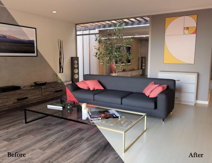
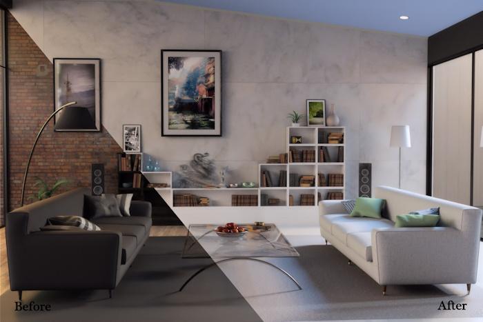
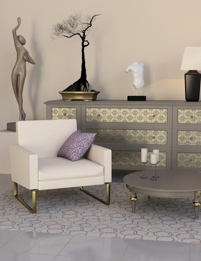 My newest set of shader presets for Iray is in the store now and it is a bit larger than my normal sets. And a bit more varied. My goal was to try and cover any sort of surface that you might come across when you "redo" an interior environment. Because it is pretty big and rather varied I thought that people might have some questions this time.

fp1.jpg
700 x 538 - 141K

fp2.jpg
700 x 467 - 113K


fp3.jpg
700 x 910 - 254K
Post edited by Cris Palomino on


Comments
That marble looks SO fantastic :D I can't wait to see this in the store :D
Thank you. I really love how they turned out as well. And it is in the store now!
Could not resist, so I have bought it. Your promos looks so nice, will try the shaders myself.
Thank you so much Artini! I really always worry like mad that the promos don't tell enough of the "story" about a product.
Insta buy! Love your lights and shaders.
Thank you. I think my long term goal with this concept is to be able to do a variety of sets that can be used to redo whole rooms throughout interior environments. I already have some of the ground work done for a more "dramatic" set with bolder colors and textures and one with a cottage feel. I also want to do some so that people can redo a bathroom or kitchen top to bottom as well. And if I can muddle my way through all of that then I will move on to add shaders for public spaces. I guess the truth is that I really love doing hard surface shaders.
Love this. Its perfect for redoing whole rooms, love that idea, and for some of the earlier stuff its desperately needed as well. Lovely color palette as well and will look forward to the bolder one too.
Edited to say that i meant to add that a lot of these fabrics will work very well for medieval items as well especially the fabrics and the wood and stone.
I hope to work around to real medieval looking bits at some point. Personally, I am a bit fan of redoing some of the more aged looking places (several of Jack's are perfect for it) and turning them into loft-like spaces. Tonight I am turning Rosemill into a contemporary living room for a promo for some props I've done. I actually got inspired by a room on tv where oddly enough they had used something exactly like I am working on as decoration. I think one thing that I really love about a concept like this is that you can steal bits from all sorts of sets and blend them together.
That would be amazing. And your promo sounds really interesting. I actually just picked up Rosemill a couple weeks ago lol. And I love to mix things up it helps make things more original.
I just bought this, based on Sonja's recommendation over in Novica's Art Studio. I'm sure this will be a lot of fun.
I'm only 1 minute into my first render with this new set, and already I am so glad I bought it! The fact that you included both horizontal and vertical wood shaders makes it worth the purchase price for me.
I'll post the promo here once I get it all sorted (and I suspect that will not be till I submit at some point early this week.. I don't think you are going to exactly recognize rosemill.. I also liberated some curtains from one of jack's other sets to try and posh up the look a bit. Two really good sets if you are looking to build out an urban room with sort of a loft-like feel are: West park treatment room ( http://www.daz3d.com/west-park-treatment-room ) which I use all the time and the old industrial interior ( http://www.daz3d.com/old-industrial-interior ) which has really great windows. I tend to find loads of spaces that can be updated into a really different sort of space but finding the furniture I want for that space is a bit harder. But being able to "recover" what I do own so that things from different sets can be used together helps some.
Here is my first redecoration with this product. I opened a Cafe Luca scene I had rendered previously for the Iray Rain product. I love the soothing colors. I think I retextured everything except the plant, window glass, coffee in the cup, magazine, skin and hair.
That looks awesome Barbult. I do love the color pallette its very relaxing.
Would love to see what you do with the West Park Treatement Room Khory! I can imagine a remake of the old industrial interior but the Treatment room is a bit more difficult
I second this. Great set, love the wood shaders.
Barbult, You picked some of my favorites for that. I am especially fond of that carpeting. I actually remembered reading on the forums that people needed both horizontal and vertical on the woods so I knew I needed to do them. I'll admit though that after doing the first full set of them I really wanted to be done and not deal with the other direction. Talk about boring to set up.
I've actually used the treatment room in a couple of promos I think. I know I used it here: http://www.daz3d.com/media/catalog/product/cache/1/image/9df78eab33525d08d6e5fb8d27136e95/0/4/04-modern-industrial-floors-for-iray-daz3d.jpg which is from the flooring I did last year.
I'm thrilled that you like the wood Melissa. It is always good to know that extra stretch is appreciated.
Sorry, it took me so long to post. I have a wretched cold and stringing 3 words together in a sitting is more than I seem to be up to today.
Oh my goodness, I love these so much. And so MUCH wood! I really enjoy reshading stuff-- half of my render time is 'test renders' where all I do is play with shaders. And while I am fangirling I wanna say I also love the bumpmaps you did for the Synthetics shader pack I picked up as a contest prize. You are becoming one of my favorite PAs.
I'm so pleased you like them Dreamfarmer. And thrilled that you like the Synthetics. I think you made a good choice with them. I know one of my friends uses that set a good bit and often in unexpected ways as fabrics. I've used them myself for walls and floors and not just on clothing.
I'm excited to try this on the new Christmas Dinner set. I think your shaders would look fabulous in that room!
I think your right Llynara. I suspect that it would benefit from adding a few new material zones in the geometry editor, but that would be easy peasy. The walls especially would be good to do so that the trim could be a different color.
Never would have guessed that was westpark lol. Wow what a difference!
One thing I always try and do is look at the "bones" of the room. I also look for rooms with good windows on the side that I can have light come in. If they are unique looking it is a big plus.
Looks awesome and it will add a ton of flexibility to sets.
Thank you GoM!
I'm liking the soothing neutrals, but I'm also looking forward to a new set with some more vibrant colors. I'm glad to hear that you are planning some additional sets. Meanwhile, I'm retexturing a set that doesn't really need retexturing, because it already has great Iray materials - Dumor3D's Simple Living Room. Still, I'm having fun changing things for the heck of it. When you start applying shaders, you begin to really appreciate well created models like Simple Living Room. So far, every prop I've modified has been separated into meaningful surfaces with perfect UVs that let me texture things appropriately.
I'm looking forward to the bright colors as well. Frankly, I tend to go for those first most of the time when I want to redo things. And I found some really awesome rooms in amazing colors when I was doing my early research. I actually started 4 sets initially because I would fall in love with something and want to do that pattern or color right then. The tricky bit is fleshing it all out though. It won't be as hard going forward because I have a bit of a template of the sorts of things I want to have.
Dumor does really wonderful work. I'm a bit fan of his work and a big fan of his as a person as well. I'm always thrilled when I get a product and it turns out to be really easy to work with. But I also like the ones where you can add some new surfaces and get a really different look from an object. For example, I am perhaps overly pleased with how that dresser turned out with the metal on the drawer fronts. Overall I am pretty lucky about my selections to redo. Every so often I run up against one where the uv is a bit sketchy for adding a different texture to it but that is thankfully rare.
I am looking forward to the brighter colors as well. Love to mix and match and lovey room in neutrals with some bright pops of color (or vice versa) can be a lot of fun
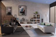
I think as promos go this one is pretty "meh" so it may not make the cut. But it does sort of show how much you can change the look of a space. Room is rosemill, curtains are from one of jacks big epic spaces, the benches are from a museum set and the table is from a romantic tent set.
That looks so serene! And totally different from the original. I would so be in there curled up with a good book.
I like the way it turned out. Normaly I am more drawn to blue than pink, but I think blue would have made the space look too cold.